Friday, 13 September 2013

Filofax pros and cons: pocket size and smaller


Well, in the first post of this series, I covered the A5 filofaxes I have and was somewhat gratified to realise that I use most of them. In the second post, I covered the personal filofaxes and two Mulberry A6 binders I have. Most of them aren’t in use and I might well sell a couple of them.
In this post, I will cover the pocket filofaxes and smaller.
Here we go:

Type
Pros
Cons
Current use/location
Selling?
Aston in orchid
Pretty colour; 19mm rings; 4 card slots and other useful pockets
Slightly dry feel to the leather; doesn’t quite lie flat
Unused
Bottom drawer of my desk
Probably. I used it for a while and got on well with it, but if I’m going to use a pocket filofax, I think it would be the Baroque
19mm rings; 4 card slots plus other pockets; lies flat-as-a-bat
Slightly useless zipped pocket
Unused
Bottom drawer of my desk
No
Fantastic colour; 4 card slots; other useful pockets; 19mm rings
Does not lie flat; card slots quite stiff
Unused
Bottom drawer of my desk
Probably
(make me an offer!)
Black Cavendish
External pocket (like a wallet); external zipped pocket; four card slots
Does not lie flat; 15mm rings
Unused
Bottom drawer of my desk
Not sure
Black Portland
Four card slots; zipped, gusseted pocket; lies flat-as-a-bat; gorgeous leather
Black, so not bright enough for me; 15mm rings
Hubby uses it
No
Four card slots; zipped, gusseted pocket; lies flat-as-a-bat; gorgeous leather; fabulous colour
15mm rings
Unused
Bottom drawer of my desk
No
“Loki”
Green patent leather Mulberry
Four card slots; gorgeous leather
15mm rings; card slots a bit stiff; zipped pocket too small
Unused
Bottom drawer of my desk
Maybe; I do love it (but will probably never use it...)
Four card slots (in a mini!!); other useful pockets; fabulous colour; gorgeous leather
Small! Zipped pocket not useful
Unused
Bottom drawer of my desk
I was about to type Probably, then went and looked at it to check the pockets and now the Probably has become a probably not!

So, that’s another eight binders, many of which I don’t want to sell and none of which are in use at the moment (and of them, only really two are potentially usable by me – the red Portland and the black Baroque). Why do I find it so hard to let them go? With the pockets, I think it is because I wonder if I might go back to a planner plus a wallet – the reason they don’t work for me is because I try to combine the two and they are just too small. If I went to planner plus wallet, the 15mm rings wouldn’t be a problem. But also, I think I am just an inveterate hoarder!

Anyway, as of today, I am the owner of 7x A5 filofax, 2x A5 Mulberry, 7x personal filofax, 2x A6 Mulberry, 6x pocket filofax, 1x pocket Mulberry, 1x mini filofax. Total:26

Gulp.

Stop buying them!

Wednesday, 11 September 2013

Filofax pros and cons: personal size


In my last post, I summarised the main pros and cons of my A5 sized binders and what they are used for. Although they total nine (eek. Really??) they are all (bar one) in use. The same cannot be said about the collection of personal size filofaxes (and two Mulberries) I have. Here we go (take a deep breath!):

Type
Pros
Cons
Current use/location
Selling?
Gorgeous colour; lies flat-as-a-bat; excellent layout; squishy leather
None
Bottom drawer of my desk, as I can only use one carry-around at once
Ha ha ha ha ha
No
Gorgeous colour; lies flat-as-a-bat; excellent layout; squishy leather
None
My current carry-around
Ha ha ha ha ha
No
Green Portland
Excellent quality; great colour; good interior layout; lies flat-as-a-bat; soft leather
Could do with one more pocket inside
Lives in the bookcase next to my desk
No
Navy Portland
Excellent quality; great colour; good interior layout; lies flat-as-a-bat; soft leather
Could do with one more pocket inside; the zipper cover is easily bent
Goal-planning filofax plus other household stuff
No
Rich colour; zillions of pockets; good layout; lots of card slots; lies flat-as-a-bat
Not a bright enough colour for me; some of the pockets are not all that useful
It’s in the drawer of my desk, unused
Probably
Rich colour; zillions of pockets; good layout; lots of card slots; lies flat-as-a-bat
Some of the pockets are not all that useful; the colour isn’t quite bright or classical enough for me
It’s in the drawer of my desk, unused
Probably
Great card-slots; 30 mm rings; good quality; lies flat-as-a-bat
It’s black and I need more colour usually; fully loaded it weighs a tonne
It’s in the drawer of my desk, holding spare inserts
No (it’s a Cavendish; it has 30mm rings...)
“Red”
A6 Mulberry in red patent leather
Great quality; fantastic colour; excellent page size (and easy to make inserts for)
The card slots are too stiff;
Didn’t lie flat easily
It’s in the bottom drawer of my desk, singing siren songs to me
No (she would kill me first)
“Indie”
A6 brown leather Mulberry
Great quality; sexy as hell; excellent page size (and easy to make inserts for); lies flat-as-a-bat
The card slots are a bit stiff
Malawi binder – holds diary and notes and so on for going to Malawi
Ha ha ha ha ha
NO!

I did have a grape domino, but I gave that away. I will probably sell the two Holborns (anyone interested, give me a shout!) – they are lovely but they are not as lovely as either the Baroques or the Portlands so the chances of me using them again are zilch.

Next up, the pocket size binders and smaller. Oh dear. Oh dear oh dear.

Monday, 9 September 2013

Filofax pros and cons: my A5 collection

After now purchasing another three filofaxes in the last month, I thought it was more than high time to take stock.  So, here we go - a pros and cons (and uses) of all my filofaxes/binders.
First up: A5

Type
Pros
Cons
Current use/location
Selling?
Red Finchley
Gorgeous leather; fabulous colour
Bit too squishy – feels like the smallest thing might damage it
It was my book-o-fax, but I outgrew it and now it’s holding spare paper etc.
Bottom drawer of my desk
No
Gorgeous leather (though a waxier feel than the red one); interesting colour
Bit too squishy. Colour interesting rather than gorgeous
Holding my filopal letters and paper etc.
On the bookcase next to my desk
No
Red domino (1)
Great colour; sturdy cover; cheap; 30 mm rings
Non-leather; weird smell when new
Book-o-fax volume 1
On the bookcase next to my desk
No
Red domino (2)
“”
“”
Book-o-fax volume 2
On the bookcase next to my desk
No
Red domino (3)
“”
“”
Writing filofax (holding notes about publishers and agents and ideas for things to write)
On the bookcase next to my desk
No
Ultraviolet domino (1)
“”
“”
On the bookcase next to my desk
No
Ultraviolet domino (2)
“”
“”
“Me” filofax – holding notes and life-coaching stuff
On the bookcase next to my desk
No
Mulberry ‘Big Indie’
Gorgeous leather; beaten up look; sexy as hell
Um, none. I’m in love
Currently holding a print-out of a book I’m halfway through writing
It’s also on the bookcase next to my desk
Ha ha ha ha ha
No
Mulberry ‘crocodile tummy’
It’s a Mulberry
It’s not in great condition and the leather is an interesting rather than beautiful colour
It’s my work binder – stays at work; holds my work diary and notes
No

Eek. I hadn’t really thought about the fact that I have seven A5 filofaxes and two A5 Mulberry binders. But at least they are almost all in use!

Which is more than can be said for the personal size binders... walk of shame coming next!

Sunday, 8 September 2013

Reviews of Grandluxe products (1)

[warning: long post with many pictures. Click on any picture to enlarge]

A couple of weeks ago I was approached by Grandluxe who asked me if I would like to review some of their products. I said I would be delighted to, adding that my reviews would be an honest appraisal of the product and would not be merely an advert for them, but that if they were happy for me to review things on that basis, I would be more than happy to do some reviews on here. They were happy with that agreement and said they would send me some samples.


I had a look at their website www.grandluxe.com and read over their “About Us” pages and some of the product details. Below is a screen-capture of the website on the ‘About Us’ page.

They do a range of products under four different collections: Grandluxe, Paperluxe and Monologue, which are paper products of a variety of styles and quality, and Luxe, which is a collection of leather products. In fairness to Grandluxe.com, they did ask me if I wanted to review their leather products too, but I declined as I genuinely have no need of them. The screen-captures below are all from the Grandluxe website.


I was expecting maybe a couple of notebooks to come – maybe one of their cheaper notebooks and perhaps (if I was lucky) one of their more expensive ones to show the range of their products.

Then a huge box, and I mean HUGE box arrived the other day, with 25 notebooks in it. Yep, you read that right. 25! I will be reviewing for some time!

So, what arrived? Here goes. Numbers relate to the picture below.


1.  A4 Monologue sketch pad, red cover
2.  A5 Monologue sketch pad, orange cover
3.  A6 Monologue sketch pad, blue cover
4.  A5 Monologue Jotter, grey cover
5.  A6 Monologue Jotter, orange cover
6.  A4 Monologue basic notebook, black cover
7.  A5 Monologue Platinum, black cover
8.  A5 Monologue Platinum, gold cover
9.  A6 Monologue Platinum, silver cover
10.  A6 Monologue Platinum, bronze cover
11.  A5 Monologue ruled notebook, black cover
12.  A5 Monologue ruled notebook, yellow cover
13.  A6 Monologue ruled notebook, orange cover
14.  A6 Monologue ruled notebook, purple cover
15.  A7 Monologue ruled notebook, brown cover
16.  A7 Monologue ruled notebook, pink cover
17.  A8 Monologue ruled notebook, red cover
18.  A8 Monologue ruled notebook, green cover
19.  A6 Monologue sketch book, soft black cover
20.  A5 Déjà Vu notebook, brown cover
21.  A5 Déjà Vu notebook, green cover
22.  A5 Déjà Vu notebook, lime cover
23.  A6 Déjà Vu notebook, orange cover
24.  A6 Déjà Vu notebook, blue cover
25.  A6 Déjà Vu notebook, grey cover

Phew!

I will review each type of notebook in turn, but today is the turn of the Platinum.

Screencap from website

As I have multiple copies of the different types of notebook, I am going to be doing some giveaways at the end of the series of reviews. But, in order to review them, I do need to open the packs of at least some of them! Consequently, I have opened the black A5 and the bronze A6 (on the basis that these are the colours I like the most and therefore am less likely to be giving away!).


A5 Monologue Platinum (black cover) and A6 Monologue Platinum (bronze cover)
The Platinum range are not just notebooks, they have other pages in there too: some address pages and some pages for recording web addresses/blogs and then a notebook at the back. To be honest, I’m not sure if I will use any of these particular books (but I most definitely have my beady eye on a whole heap of the other samples!).

Walk through:
Front cover/exterior
The books are hardcover, with metallic PU over card. They come in three metallic colours: gold, silver and bronze, and black as a fourth colour. There is a colour-coordinated elastic closure (brown on the bronze book, silver on the silver, dark gold on the gold and black on the black). There is also a ribbon marker.

The colour coordination of the bronze book is the worst – the elastic is brown, the cover is greenish bronze, the edging of the book is gold and the ribbon marker is another more metallic brown (but much more red than the bronze colour of the cover). I took two pictures (below) with slightly different lighting. Colour reproduction isn't bad (on my screen). The colour co-ordination of the black is very good. It has silver edging which looks very smart and naturally, it is an easy match to get black elastic and black ribbon in the same colour.

The silver and gold books remain unopened, but are well matched. The gold book has gold edging and the elastic and the ribbon are the same colour; likewise for the silver book which has silver edging and matched elastic and ribbon (as far as I can tell without opening the packages).
Behind the elastic closure, the cover is slightly depressed and the surface is shiny, rather than the slightly pebbled texture of the rest of the cover. There is no branding on the front. On the back “monologue platinum” is engraved into the cover in a modern sans serif font in a pleasant, understated way (though those of you who hate all branding won’t like it probably).

Front cover
Edge (this was nigh on impossible to photograph!)
Back cover
The uncoordinated bronze
Bronze again

Interior
The covers are lined with paper. Both the black and the bronze books are lined with black paper; I assume the others are too. There is a title page with monologue platinum on it, then the next RHS page has space for personal details. At the bottom right hand side of this page is more branding. This time saying Paperluxe.
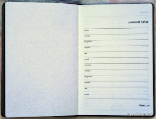
A5 first page

There are then 6 pages for addresses; 6 to a page in the A6 version (line spacing 4.3mm), 8 to a page in the A5 version (line spacing 5mm).

A5 addresses pages

Following this there are 6 pages for website and blog addresses; 24 to a page in both the A5 (line spacing 7mm) and the A6 (line spacing 4.7mm).

A5 website and blog pages

The reverse of the last page for website and blog addresses is blank and the rest of the book is for notes. Each page has a large top margin (23mm in the A5; 12mm in the A6) and 25 lines per page, with the top and bottom lines on the page darker than the others. Line spacing in the A5 is 7mm; in the A6 it is 4.7mm). The lines do not go edge to edge. In the A5 there is a 10mm gap on the inner margin and a 7mm gap on the outer. In the A6, these are 9mm and 6mm respectively. All of the pages are sewn rather than glued.

A5 - start of notes section
A6 not really laying flat + ribbon marker

Despite being sewn, the books do not really lay flat. The A5 lies flatter than the A6, but still needs holding down.

Back Cover
The back cover has a pocket in it, made from the same paper that lines the inside of the cover – thicker than writing paper; I would put it at about 100gsm. It feels more flimsy than the pockets you find in Moleskine notebooks, but would be more than adequate for most purposes. There are no stickers or suchlike included.

Pen Tests
I removed a leaf (4 sides in total) from the black notebook to do the pen tests, rather than (as ever) having a page in the book with scribbles and notes on. The paper is described as 80gsm, acid free fine white paper. It is smooth to the touch – maybe a smidgen less polished feeling than Clairefontaine paper.

Pen test

Fountain pen test: yikes! Don’t go there! The feathering is dreadful and the bleed through makes the other side unusable. The Ohto Tasche was especially bad – like writing on blotting paper and it even bled through to the page after! It is a very wet nib though.
Other pens: okay. The Pilot V5 hi-tecpoint 0.5mm pens were fine – no feathering to speak of and acceptable bleed through. Biros were absolutely invisible on the other side (I just hate writing in them).

Pen test: reverse
Overall
An interesting notebook although the combination of addresses and web-addresses at the front (why not at the back?) and notes behind them was (to me at least) a bit strange and I can’t really envisage when I would want all three in a book. Web addresses/blog addresses I would always keep electronically. Do people really write them out and then type them into the address bar in their browser? The poor colour coordination on the bronze was disappointing (but the other notebooks are superbly coordinated, so don’t take that as too much of a negative!) and the OCD-like aspects of my character squeaked a bit at the changing line spacing as you went from section to section.
The paper quality was quite poor. I know some of my fountain pens are ‘challenging’ to paper, but this paper struggled and failed with anything other than a rollerball and a biro.

Overall score: *** (out of 5)

Details of how to find Grandluxe products:
Monologue on Facebook: http://www.facebook.com/ilovemonologue

Disclaimer: although I was given these books to review, this has been my honest opinion of the book reviewed. I have not been paid to review the books, nor am I in the employ of Grandluxe.

Putting off planning

Putting OFF planning? Huh? Isn’t the whole point of planning, to, um PLAN?
Well, yes. But I’ve been where I am now, before. Where I am now, I’m not sure of my goals. Not really. Which makes progressing towards them a bit difficult.

This happens to me regularly and always when I get really busy. I don’t have enough time to think. All I do is stagger from one thing to the next and my to-do lists get filled up with ‘stuff’. Stuff that needs doing (but in all honesty, maybe not now and maybe not by me). But I get so busy doing all the ‘stuff’ that I don’t have time to plan my things properly. So then my to-do list gets emptier of my things and then there’s more space for more ‘stuff’ so I fill up my time with ‘stuff’ and before I know it, I haven’t looked at my goals for ages and I feel like I don’t have time to sit and think, especially when  there’s all this ‘stuff’ piling up around my ears. And then when I do have time to look at my goals, they seem alien and maybe not up to date.

That’s where I am right now and although I could shift things from my goals to tasks sheets onto my monthly and weekly lists, is there any point if the goals generating the tasks aren’t right?

So, it’s time to step back, start saying no to things and focus on my aims, values and (ultimately) goals and projects. I’m going to spend some time thinking about where I am and where I want to go (and therefore how to get there).

I’m going to use my new-to-me (vintage) navy Portland for all this. Before I even get to the goals and projects sections, I’m going to have a section where I can spend a bit of time on ascertaining my aims and values (effectively life-coaching myself) and only then will I review my goals and projects.

There’s really no point following the map if it leads you somewhere you weren’t still wanting to go to.

Portland Festival!

I was both delighted and dismayed when a couple of weeks ago, I saw that The Crazy Suburban Mom had spied four Portland filofaxes for sale. Delighted because I LOVE my green personal Portland and have always kept an eye out for more Portlands  and dismayed because, with all that advertising, they were not going to go for the small sum that I got my green Portland for, a few years ago.
However, I needn’t have been too worried because it turned out that there aren’t that many other aficionadas in the world (or at least in the UK) and I snagged my red pocket Portland for a song and then I bagged a blue personal Portland for another song.
I’ve already reviewed the red Portland here. Let me now walk you through my blue one. In essence, it’s just like my green one but blue, but hey, it’s new to me and some of you might not want to go flicking back through old reviews.


The Portland is a very well made binder. It’s leather – both the exterior and the majority of the interior are a soft leather: only the linings of the pockets are in material. It also has two pen loops (all leather; no elastic; smallish pens only (though nowhere near as tight as the Baroque!). And of course, it lies flat as a bat! No training, no persuasion. Just unsnap the clasp and open. Ta-da!!

Flat as a bat

The interior layout:
On the inside left, there is a zipped, gusseted pocket which makes getting coins out of it a breeze, and because it is at the front, doesn’t rumple up all the pages (which, if it was at the back, it would). The back cover has six credit-card slots with a full-height pocket behind.  The zipped pocket is lined with fabric, as are the pockets at the back. Rings in both of my personal Portlands are 23mm (all perfectly aligned), but there was a Portland Grand with 30mm rings produced (which now seem rarer than hens’ teeth!).

Inside left
Gusseted pocket
Inside right
Now, if you read my review of the red pocket Portland, you may remember that I said the flap of leather covering the zipper was different in the red pocket than in the black pocket Portland (which hubby now has). The same is true between the green Portland and blue Portland in personal size. The green version has the cover as an extension of the pocket, whereas the blue (like the red pocket) has a flap that comes from above the zipper. I prefer the extension-of-the-pocket format, not least because the flap-from-above-version can get bent (as it has in the blue version). Does anyone know why and when they changed the format?

Extension-of-the-pocket zipper cover
(compare with the blue version above)

So, what will I use this filofax for? Hmm. I’m not sure. I bought it because it was blue and a Portland (which is at least one more reason than I bought the green version)! I think (think) I will use it for more detailed planning of my goals, which would allow me to remove those pages from my main carry-around binder. After all, I don’t really need to carry all that around with me – I just need to have looked at it at the weekly and monthly review sessions. I could also easily swap into using it as my carry-about planner if and when I want a break from the Baroque(s).

Friday, 6 September 2013

DID I downsize to 15mm rings?

No.

Moving on...


What, you want the gory details?

Oh... Alright then.

The card holders did for me. They always do. By the time they were on and the cards were in the slots and the duplex diary with notepaper interleaved were in, it seemed pretty full. The address book would have fitted well in the slot behind the cards, but then the back was getting a bit bulky and then I couldn’t find anywhere sensible to put vouchers... and in rummaging around in the bottom drawer of the desk where the massive filofax party has been going on for MONTHS, I saw Red and then I was tempted to move back into her, since she started bleating on about, “well, if the card slots are filling it all up and you’re only using it because it’s red, then what about me?? What about ME???”

So I shifted everything back to the Baroque. If I ever move back to a planner plus wallet system, I would use the Portland in a heartbeat, but to try and combine the two functions in a 15mm ring binder seems beyond me.

Oh, and I've also recently acquired a navy blue Portland in personal. More on that soon...

Wednesday, 4 September 2013

Home-made WPP diary in pocket size

In an earlier post, I wrote about designing my own diary for the pocket filofax. Here’s a quick summary of it.

As I have said before, I don’t need much from a diary! I need the date range across the top of the page and I need space. I don’t need lots of information about holidays around the world, five different languages or the mini-calendar thing taking up real estate. I need all the days to get equal billing as I can be just as busy at the weekend as I am in the week.

So, armed with Open Office (because I know how to define the format of the result of the field entries in the word processed document using that programme and I haven’t worked that out in Word yet) and a source file for the dates, I produced my own minimalist version of a week per page (WPP) pocket diary.

When I say minimalist, I’m not kidding. I set my page size to pocket filofax paper size, + 5 mm all round (see sneaky trick below for why). I set my margins to 5 mm top and bottom and outside edge, 10 mm for the inside edge and margins mirrored. The actual diary part was extremely simple: basically a table of eight rows and one column, with the date range in the top cell and the days in the other seven.

My sneaky trick, because my printer whinges about small margins and it can be tricky to make them small enough to make the best use of the paper, is to set the page size of the file to 12.5 cm height (the filofax paper is 12 cm) and width 8.5 cm (rather than 8). Then it gets printed closer to the edge of the paper. I used filofax pocket paper (bizarrely, dated 1997 - I must have got it in a second-hand binder!) and manually duplex-printed.

Here’s the result: (click to enlarge)

Two weeks of WPP
Close up

I did say it was minimalist, didn’t I?
Let’s see if I can downsize into a 15 mm ring pocket by using it.

Sunday, 1 September 2013

Can I downsize to 15mm rings??

As I said in my last post, I have bought a red pocket Portland with the somewhat significant drawback of it possessing 15mm rings. Can I downsize to move into it? I am currently using a 23mm ring personal Baroque, so it’s a tough challenge!

The main things on the rings are the diary, addresses and card-holders. The amount of space I have for notes is relatively small. So, can I move to smaller versions of any of these?

Diary:
Well, this is always a bit of a nightmare for me. I like to be able to see a week at a time, otherwise I don’t have an overview and I’m just lost. BUT, I also have to have my to-do/notes page for the week visible when I open my filofax, because even if it only a page away and marked really, really clearly, there is some part of my brain that just ignores it and I don’t look at it. The upshot of that is, that I really need a week + notes format. Can I manage that in something as small as a pocket? That’s the bit that remains to be seen. I know I can cope with a pocket week to view, size-wise, as I have done it before. The week plus notes by filofax wastes far too much real-estate for me to get it. I’ve said before that my diary needs are pretty simple. I need the date range across the top and the day and date on the day space. I don’t need the mini-calendar thing, I don’t need umpteen languages, my work doesn’t recognise most of the UK Bank Holidays so I sure as heck don’t need to be reminded how many OTHER people in the world are on holiday each day. I can tell what the moon looks like by looking at it and couldn’t care less whether it is full or not (photographer hubby does!).

I’m also pretty handy with word-processors and mail-merge stuff so I could make my own diary. I normally prefer my week per page to be lined, but a week per page pocket would be too small for this.
I’ve also realised that I don’t actually need the notes pages in more than a month ahead, so I could duplex-print the diary and just insert a lined page between the weeks at the start of the month. Anything needing noting more than a month ahead could go in the coloured monthly pages I have for advanced planning. I don’t mind that the week changes sides each week. For a full year, the diary section could then be:
26 pages of week per page (52 weeks, duplex-printed)
12 pages for monthly planning
2-3 pages of notes for the weeks, inserted between the weeks (again, these can be used on each side)
1 page for ‘beyond 2013 planning’
Total: 41 pages

Card-holders:
As I like my binder to be wallet and planner, being able to carry cards easily is essential. The Portland has four card slots in the back cover, but I generally want to carry a whole heap more than that and this is where the 15mm rings might struggle. Each card-holder can hold an additional four cards. I need two more card holders and they take up a LOT of space on the rings.

Addresses:
This might be less of a problem soon as I am about to buy a smart phone (yes, as in I haven’t possessed one before now). Until then, I could use the address book that came with the Flex as it could tuck in behind the card pocket in the back.

The project notes and capture notes are fairly small in number – maybe 20 in total, so in theory, this is all feasible.

But, as I said in my last post, there is the significant danger that trying to squeeze into a red Portland will only trigger me to move back into the red Mulberry.... it’s red, it has the same number of card slots as the Portland but it has a bigger page size and a better page format.

Watch this space!