Showing posts with label A5. Show all posts

Saturday, 10 August 2019

Life A5 notebook

As Stu says over on Nero's Notes:
Life notebooks are coveted by anybody who values quality paper. The Noble line of Life notebooks in particular are beautiful, featuring Life's superb fountain pen ink friendly Japanese paper, which is cream in colour and finely laid. As you would expect, the paper in the Life Noble notebook is acid-free and archival quality. This A5 sized notebook comes in plain, ruled and graph paper (5mm grid paper and 8mm ruling) and features the LIFE logo, embossed in gold. 
I've been using a ruled Life notebook for making notes on the gazillion things I need to think about/do/investigate ready to self-publish my fantasy trilogy later this year. I'd been umming a ah-ing over which notebook to use (something I suspect only stationery nerds like me do, because we have so many notebooks to choose from...), so let me share my reasoning for why I plumped for the Life notebook over the other million I have in my stash.
Well, first up, the paper is fountain pen friendly. I realise that many people won't care about that, but if you do care about that, you generally really do care about that. A paper that feathers or ghosts or lets the ink bleed through to the other side drives you insane. But, even if you don't give two hoots about this kind of thing, if a paper is good for fountain pens, it's generally amazing for any pen. Or pencil.
The paper is thick enough that there's minimal show-through and there is no feathering at all. Dry time is a little on the long side, so lefties may want to think about that, and you may want a sheet of blotting paper handy too.
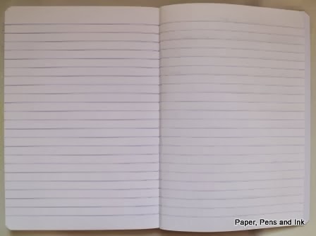
My only niggle with the paper is that it's a yellowish cream and I prefer off-white or a light ivory, but that's just a personal preference.
There are 100 pages (sides) in the book. This is a happy medium between the slimmer notebooks available (68 or 72 etc.) and the chunkier 168+ page books. I'll have a lot of notes to make, and a slimmer book will probably be too small, but I hate waste and it would annoy me if I only used half of the pages in a larger notebook.
But one of the things I love the most about these notebooks is this:

The little dots at the top and bottom lines. These are perfect for if you want to add a table, because you don't have to faff about measuring it out. Fear not, the marks are small enough that if you're not needing to draw out a table, they won't distract. They're spaced at 10 mm (which a bit of my brain sometimes squeaks at because line spacing is 8 mm, so drawing vertical lines leads to rectangles, not squares).
Since I'll be making notes on a variety of sub-topics in the book, I'll be putting a table of contents at the front (and may even put an index at the back!), and there may be a number of topics where being able to quickly draw a table is a bonus, for example when I'm comparing different editors or cover-designers.
I also like the top margin with a slightly darker top line. The top margin is 15 mm and I use the space to put a few-word summary of the page contents (like 'print on demand' or 'keywords') so that when I flick through the book I can see what's on each page.
There are no fancy frills like ready-printed page numbers (I've just hand-written them in) or a ribbon-marker or a pocket in the back, but this is a good, solid notebook at a very decent price. Why don't you give it a whirl?
A modified version of this post first appeared on Nero's Notes.
*The post contains affiliate links, which help me to be able to run this blog, at no cost to you.

Tuesday, 27 December 2016

What will I be using in 2017?

I've pretty much settled into a system now and so I'm all set up, ready to go for 2017. In this post, I'll tell you about the components of the system; in the next post, I'll show you how it all fits together.

The System:
One carry-around. This is my Meadowgate TN and it contains a week + notes diary, a monthly insert and a notebook
An A6 daily planner
A separate notebook with Goals to Projects to Next Actions.
An A5 day per page diary to write up my day in

Friday, 23 December 2016

Back in a Ciak (again...)

A5 day per page Ciak diary
Most years, I've had an A5 Ciak which I've used as a daily diary/journal. It's not used for planning, but used to record the day and also my thoughts. One year I made the terrible, terrible mistake of buying a Moleskine. I still shudder when I think about 2013.

2014 saw me back in a Ciak, as did 2015. This year, I won a Quo Vadis Forum page per day diary. I've been struggling womanfully through the year with it (see this post and this post for how well/badly it's been going). I won't buy another though. It's been okay to record highlights of the day and a quick summary, but what I really want is somewhere to not only do that, but reflect on the day too. I used to do that in the Ciaks and will go back to it next year.

As ever, I got my Ciak from The Journal Shop (no affiliation, just a happy customer). I was amazed to see that they were only £4.99 when I got mine. And... I had a 20% off code so in fact, I got it for £4 which is just amazing! They are normally about £15 and seemed to be back up to about £13 when I next looked.

Why do I love the Ciaks so much? The paper quality isn't fabulous and back in 2012, it was the paper quality that pushed me to a Moleskine (which was then even worse than the Ciak). I'll try it out, but I'm not convinced it will cope with fountain pen, but then I'm not sure there are many A5, day per page that do cope with fountain pen. Ciak seems to have stopped claiming that it's okay for fountain pen.

One thing that I demand from a diary/journal is that Saturday and Sunday each have their own page and don't get forced to share a page!

Separate days for Saturday and Sunday

I also love the horizontal elastic closure which is snug enough to hold a pen against the edge of the pages.

All in all, I'm pretty happy to be back in a Ciak for 2017.

Sunday, 1 May 2016

Bullet journalling update: A5 for long-term goals

Just before I went away on holiday, I was experimenting with two bullet journalling things:
  1. long-term planning in an A5 Leuchtturm
  2. day to day planning in an A6 Clairefontaine grid book
I took both of them away with me; the long-term planning to get filled in (since I thought the perfect time to stand back and think about long-term goals was when I was relaxed) and the A6 day to day, to note things about the holiday so that I could write my journal up when I came back (to save me taking it away with me). I'll show you what happened with the long-term planning version here and save the A6 for another post.

Long-term planning:
A while back, I won a turquoise A5 Leuchtturm notebook, a turquoise pen-holder and a pencil as a set from Bureau Direct, and this was the set I chose to use.
The first thing I did was to set up the first few pages for goals relating to my life-areas. I wanted to make the pages of the book a little bit prettier but I'm not very artistic, so I used pennant washi for headers and wrote the life-area on top of it. I put year plans on the LHS and quarterly plans on the RHS; one double spread for each life-area. I shall be referring back to these pages over the year. The only one not too personal to show you, is the house/garden one.


I then drew up a list of things to get done in the remainder of April, again using the pennant washi for the title of the page. The contents are too personal to share, but here's a picture of the washi!


I try to do monthly reviews, so the RHS will be for reviewing how the end of April went (and may continue over the next pages too). I used more washi, but some small hearts rather than the pennant, and labelled it 'review'


The list of stuff to be done is partly drawn from the life-area lists and also just a dump of things in my head that I think I should be doing, following my bullet-journalling system of a dot for a task (crossed through when accomplished). A dot converted to an arrow will mean the task has been carried forward and rewritten on the next month's list, but I'm showing you the set up before I do my monthly review.

This isn't 'pure' bullet journalling (if there even is such a thing), but my way of trying to keep track of the bigger picture. It's a list of goals and is essentially the 'goals to projects to next actions' of my planning system, relocated to a book. By breaking things down into life areas, I'm hoping it will help me to balance everything a bit better (and not just focus on writing, writing and a bit more writing...). I will (since I bought the pens...) use different coloured Staedtler Triplus fineliners for the different life areas, to give me a visual breakdown of the balance (but I only took a pencil away with me! May will be more colour-coded than April was...).

A more 'traditional' use of bullet journalling with a combination of tasks, notes, waiting on etc. is going on in the A6! More on that in the next post.

It's still a work in progress but has surely got to be better than no real system at all (which is how 2016 has been so far!). In time, I may move all of what's currently in the A5 and what's in the A6 into one book, but the A6 is working too well for me at the moment (in an 'if it ain't broke, don't fix it' kind of way!).

What do people think? Hints and tips from anyone? Is anyone using a bullet journalling type system to deal with long-term plans? Let me know in the comments?

Sunday, 20 September 2015

Circling back almost to where I started...

Life is about to change enormously for me as I leave work purgatory in a week. I'm wondering what system will work well for me once I am pretty much in charge of my time. In trying to help me to decide, I thought I would run through what I've used over the years and what has or hasn't worked for me.
Basically, I have chopped and changed almost as many times as I've had hot dinners, and wasted huge amounts of money on trying to find the 'right binder' (when I was probably hunting for the right system), but a few things have become apparent: I like week+notes and a DPP. Pocket doesn't work for me, however cute the binders are. And I'm rubbish at turning the page so in fact, I don't need to carry both W+notes and DPP around with me; just the W+notes will do!

How did I get to this point of realisation? Read on (if you're suffering from insomnia) and I'll take you through the disasters of the years!

In the beginning (a.k.a. 2011)
January: I used an A5 at work and an A5 at home and was struggling to get my head around using a personal for my day to day carry around. I was also debating whether or not to buy a personal size filofax! Scoot forward to April 2011 and I was faffing over A5 or Personal and wrote this post about what I needed in a carry-around. It's really interesting (at least to me) that what I needed then is exactly what I need now! Even then I found it nigh on impossible to turn a page to see what I was supposed to be doing and liked the thought of a week plus notes. Plus ça change and all that.

By the end of April 2011, I had moved wholeheartedly into the pink Baroque and was loving it. It functioned as my wallet as well as a planner and I loved it. I then bought a turquoise Baroque. And then a green Portland.

It's now beginning to get embarrassing reading over these old posts as, in August 2011 I was pondering personal or pocket and deciding to stick with personal (see the post here) but by the end of August 2011 I had bought my first (of many!) pocket filofaxes - a pocket Cavendish (see here for the post saying I'd bought it and here for more details on the binder). However, I stayed in the personal size (and the pocket went into the drawer of my desk and tried to have a party on its own) and even bought a Cavendish (see here and here for details).

2012
2012 was a year of faffing about, BIG TIME! Though I do note that I realised even then, that a month to view did not work for me!
February: I was wondering about moving into pocket size (see here); I bought the pocket Aston (see here) and moved in (see here).
April: I'd bought a personal Holborn (see here) and was wondering if I had planner fail (see here).
May: I was still in the pocket Aston and had shifted to week + notes for the diary (see here)
By June, I was in the personal Holborn; by July I had bought two A5 Mulberry binders (admittedly not as carry-arounds!); by August I'm on about the current carry about being the pink Baroque again, but had bought a Mulberry A6 and a pocket Baroque... In September, I moved into the A6 Mulberry (Indie). My old foe, the desire for colour had struck again by December and I was out of Indie and had bought a scarlet Mulberry AND a wine Holborn.
So, in 2012 I had used: personal, pocket, personal, A6. Would 2013 be any more stable?

No.

2013
I bought:
January - Green pocket Mulberry (Loki)
April - pocket Classic in red (see here)
August - pocket Portland in red (see here)
September - personal Portland in blue (see here)
December - another A5 Mulberry (see here)

System-wise, I was all over the place!
January - A6 Mulberry (Red)
April - pocket Baroque
May - personal Holborn (wine); August - personal Baroque
Most of the rest of the year I was havering over personal or A6.

2014
I think my favourite post of all time summed it up>>>> Siren songs
Despite those siren songs, I spent the whole year using personal size paper. Admittedly there was still some binder chopping and changing: turquoise Baroque to wine Holborn to navy Portland and then to slimlines - the red de Villiers (my most successful binder ever!) and then compact Cavendish.

2015
Well, we're not done with it yet, but I've changed system dramatically once already!
I started the year still in a compact. My beloved red de Villiers was beginning to get worn, so I moved into the wine Holborn (briefly), tried the compact Cavendish and then I tried a compact Belgravia (see here for a compare/contrast between Cavendish and Belgravia). Mid April saw a red Traveller's Journal by The Stamford Notebook Company arrive but although I loved it, I didn't move in. Instead I bought a compact Holborn (see here) and then a slimline Adelphi (see here). Despite that ticking ALL the boxes, I still shifted into the TJ, partly because it was new and partly because I needed the page size.

So here we are, several years down the line and more binders than I want to think about, and I find I am back with a week+notes in almost A5 size and a DPP in my reporter's notebook. I realise that I need a colour pop (so no more black binders!) and I need cards and money to be catered for. Whether that's in the scarlet Adelphi or the Stamford Traveller's Journal in 2016 is yet to be decided. Let's see how the last quarter of 2015 goes, once I have left hell.

Thank you, everyone who has been on this journey with me!

Saturday, 5 September 2015

Review: Hightide A5 foolscap notebook

I have been very remiss in my reviews! I have a heap of stuff to review but not so much time... LOTS more time after the end of September of course (when I leave purgatory work).

Anyway, I recently purchased a couple of A5 notebooks by Hightide (Penco), from The Journal Shop (no affiliation). The Journal Shop site describes the notebooks thus:
"Penco's Foolscap Notebooks are typical of high quality Japanese paper (the likes of which you may already be familiar with in other brands such as Life or Mnemosyne). Smooth, fountain pen friendly paper is a pleasure to write on, and the paper suffers very little showthrough and no bleed or feathering. The notebook lies open perfectly flat (with hardly any coaxing). Sewn and glue bound, not stapled."
I thought I would give them a try and a couple arrived the other day. [Click on any picture to enlarge]

Cover; first page:
The cover is card, with space on the front to write a title.

Front cover

The back of the notebook has a bit of information about the paper.

Back cover
The first page inside is a pale green (not coming out well in my pictures) for producing an index.

Index page

Evidently you are meant to write pages and pages about each thing as there are 20 spaces and there are 100 pages (200 sides) in the notebook. The reverse of the index is plain - it doesn't carry on overleaf.

Size and lines spacing:
As you can see from the information on the back cover, it is almost A5 size at 138 x 210mm. There is a blue line at the top and the bottom of the page and the other lines are in grey. Line spacing is 7mm and the top margin is 16mm and the bottom margin is 12mm. There are 26 lines per page.

Lines; line spacing
The photo shows the centre of the book and yes, it does lie flat. That said, now it has been opened out like that, the edge of the notebook is no longer smooth. There is a break where the very centre is (i.e. where I opened it out flat). This is much like what happened with the Quo Vadis APB2 (see here as long as you're not squeamish about stationery-abuse).

Pen tests!
I much prefer to write in fountain pen and so for a notebook to be worthy of further purchases, it has to be able to handle a fountain pen and for a) the ink not to bleed through, b) the ink not to feather, and c) the ink not to show through to the other side. So, how did this little notebook do?

Well, the surface is nice. It's a little 'grabby' but not too much. The pen doesn't glide in quite the same way as it would over Clairefontaine paper (for example) but it doesn't snag. The texture also allowed ink to dry quickly - faster than it does on Clairefontaine. There was no feathering and no bleed-through. However, there was show-through to the other side.

Fountain pen/ink tests
Reverse. It's actually worse than this picture indicates
Overall:
I quite like the book, though I'm disappointed at the level of show-through. It's enough to stop me wanting to use it for book plotting, but it's okay for me to use as a general notebook.

Monday, 15 December 2014

spanners

A few weeks ago, I thought I would use one of my (many) Leuchtturm A5 notebooks as a 2015 goal/project planner. There are enough pages in one to have 4 pages for every week, monthly planning pages and a few pages at the back for a year-review too. I would have set up the 249 pages as so:

Page 1: goals for the year
Page 2: Quarter 1 goals
Page 3: Quarter 2 goals
Page 4: Quarter 3 goals
Page 5: Quarter 4 goals
Pages 6-29: Two pages per month for notes/goals/lists/anything and everything
Pages 30-241: Four pages for every week (allowing for an extra week to overlap the end of 2014 and the start of 2016)
[The pages would be split into: notes for the week + Mon; Tue + Wed; Thu + Fri; Sat + Sun]
Pages 242-249: Review of the year

That, of course, was all before I hit burnout. Right now, I can’t even think what I will be doing in January, never mind the rest of 2015. Actually, I can’t even think what I will be doing tomorrow, never mind January!

Maybe I can just start to use a Leuchtturm A5 like this once I’m able to start contemplating planning again.

Does anyone else use a notebook for a home-made planner like this? If so, what do you use and how do you use it?

Monday, 17 March 2014

In praise of the A5 Domino (2)

In my last post, I wittered on about how many A5 dominos I now have, but what keeps bringing me back to them so often?

1. The price
They are frequently on offer in WH Smiths with either 40% or 50% off. (No affiliation, just always had good service from them. I have bought every single A5 domino I own from them!)

2. The 30mm rings
Huge. Just huge. And since I am generally not hefting these binders about on a daily basis, the fact they have huge rings and are stuffed (and heavy) doesn’t matter.

3. The rigid cover

I may well be using these to make notes whilst out and about (not all that common an occurrence) or whilst balancing the binder on my knee (much more common occurrence!) and the rigid cover makes this an easy task.

4. Pared-down interior

I am largely using these as binders and never as wallets and so the pared-down insides work well. The notepad slot in the back is brilliant.

5. Two pen-loops; both elastic

I surely don’t need to explain any further do I?

6. The fill

Although I bought this to use with home-made contents, I still like the fill it comes with. The one I just bought had an academic diary (July 2014 – December 2015; week to view, vertical) which will be used in 2015; A-Z dividers (okay, I’m more ‘meh’ about this as I have about a zillion sets of these now!); several sheets of coloured paper; some address sheets (okay, fairly ‘meh’ about these too); some ‘to-do’ sheets; a top-opening envelope; a ‘today’ marker’; a note-pad.
The address sheets and dividers are no use to me, but the rest of the fill is pretty good, especially the note-pad, which unlike the atrocious diary paper, handles a fountain pen okay!

For the price (£22) I think this is a great deal!

Saturday, 15 March 2014

In praise of the A5 Domino (1)

I'm either addicted, or they are breeding.
I counted how many I have (sad but true). I appear to now possess six of these things (having bought another red one, reduced price, from WH Smiths - £22).

Six???
Indeedy. Four red and two ultraviolet.

Er... why so many? What are they used for?

Two are used as ‘book-o-fax’ binders
One is a letter-writing binder
One is a ‘me’ binder
Two are writing binders: one for admin; the other as a book-planner

Book-o-Fax (2x red)
I have an ever-growing set of book reviews. I only started doing these in 2009 but am now having to move to a second volume (the reason that I needed another new A5 domino from WH Smiths!). I keep a list of all the books read in a particular year (not including things read for work) and also a review of each of them. I use a set of A-Z dividers to sort the reviews by author. This post describes the book-o-fax.

The Letter-Writing binder (red)
I write a lot of letters to friends. I love getting a hand-written letter in the post and I enjoy writing proper letters to people too. In the letter-writing binder, there are envelopes, letters from people in the filopal set-up, notes that I have made on what I have written about to people (so I don’t keep repeating myself!) and in the note-pad slot in the back is a block of writing paper.

The ‘Me’ binder (ultraviolet)
Other than a print-out of an e-book, this is disappointingly rather empty! There are a few notes I made whilst reading through a few ‘change your life’ type books and some things cut from magazines or papers etc., but I really should use this a bit more!

The two writing binders
1. Writing admin (red)
This houses notes for blogs, story/novel plans, notes on agents, which of my books are at what stage, research notes for magazines etc. As I say, general admin. I posted about it here (though the set-up has changed a teensy bit since then).

2. The book-planner (ultraviolet)
I used this one to plan the last novel, but then switched to a bound notebook. I blogged about it here, here and predominantly here. I still hum and haw about using it for book-planning but then I always prefer using a bound planner (even though I know that using a binder is more sensible in so many ways!). I might use this as a book-planner again for book 6 (which is currently getting scribbled about in a Ciak notebook, but once I get more serious about writing it, I might move into the binder). If I don’t use it as a book-planner, I may start to store character notes in it. Every character I write about gets a ‘character dossier’ and I might put them all in one place (either organised by novel or by character name – not quite sure which would be better).

So, that's why I have six of these things! Anyone else have multiple versions of the same binder (domino or other)? What makes you keep buying them? And what do you use them for?

Saturday, 4 January 2014

Review of Peter Pauper A5 Journal


[click on any picture to enlarge]

I bought this book to use as a writing scrapbook – somewhere I could paste pictures of people I think look a bit like my characters, scribble notes about scenes I can see in my head even if I’m not exactly sure where they will end up, and make general notes about the things swimming around in my head. 90% of all this will probably go nowhere but I do like to trap it all, for the 10% that is useful.

Anyway, the book that I bought was the Persian Splendour Journal by Peter Pauper Press. I bought it from Peter Pauper via Amazon (no affiliation to either, just giving information).

I was a bit disappointed when it arrived as it had obviously been dropped on its corner at some point and bent quite significantly. The packaging was intact so the damage must have happened BEFORE it was sent so it is both disappointing and irritating that they packaged and sent a damaged item.

Other than the damage to the corner, the book looks glorious. The decoration is partially embossed and quite pearlescent in places. The pattern covers the front and spine and back of the book and the book is lined with a matching blue end-paper. There is no ribbon marker however. The size is slightly larger than A5 at 18.4cm x 22.9cm (whole book; page size is 18.2cm x 22.3cm).

After the end-paper, there is a page (inevitably stuck to the end-paper) with ‘Journal’ printed on it and the Peter Pauper Press logo. On the reverse of this is some information about Peter Pauper Press.

Reverse (label came off easily)
Info about Peter Pauper Press

The pages are lightly lined and there are 192 of them. The paper is a light ivory colour and acid-free. The ‘front’ side of the page (right-hand side when the book is open) is very smooth to write on but the reverse of the page is slightly rougher. It is described as ‘archival paper [which] takes pen and pencil beautifully’. My fountain pen tests are included below, along with my general comments on the paper.

Book open - lies flat

The line spacing is quite wide – 7.9mm and the lines are very faintly marked (which I like, but others may not). There are 23 lines per page and the lines do not go edge to edge of the paper, but have a 16mm margin (binding edge) or 13mm margin (outer edge). The top margin is 22mm; bottom margin is 18mm.

The pages are sewn and so the book lies flat and with the hardcover, it will be easy to write on it even without a table to lean on.

Fountain pen tests
These were mixed. At first I was horrified and the pictures may well show you why! Any ‘wet’ nib feathered with a peculiar ‘squashed spider’ effect. Most of them did not have major bleed-through to the reverse except the Ohto Tasche (which is the most challenging of my nibs really) and the Sheaffer calligraphy (also very challenging).

Fountain pen tests: front
Fountain pen tests: reverse
Close-up of squashed spider effect
More squashed spiders
And more of them. And no, I apparently can't spell cyclamen!

However, I noticed that a new (and as yet unreviewed) pen – a very cheap Manuscript brand calligraphy pen – did not show through or feather at all, even though almost every other pen did (it's the sample saying "lligraphy - J Herbin" in the 2nd picture of the squashed spiders above). I have since changed the ink in that pen from poussiere de lune to lie de thé, and have been using it to make notes in the book and there is no feathering and no bleed-through and it has been a delight to write in (phew!). The book is also a good size for sticking pictures in, so all in all it has turned out well.

Monday, 23 December 2013

Another Mulberry...

He's actually more chestnut-coloured than this...

Some of you may have noticed a reference to a ‘new’ Mulberry heading my way in my last post. Well, he’s arrived! And he is... Drop. Dead. Gorgeous.

I may of course be biased.

He may possibly not be a Mulberry. I bought him as one and I think he is one, but the zipper doesn’t have a Mulberry logo – it’s a normal zip (by Eclair) and the binder is ‘fabrique en Angleterre’ as well as ‘Made in England’ (French on a very cheap label sticking out of the rear pocket; Made in England stamped in gold on the inside left). It was from eBay so provenance is always tricky. The zipper and the cheap label are the only things making me wonder... there is the Mulberry logo on the front and on the inside and the quality feels divine.

Zipper and cheap looking label
Do I care if it isn’t actually a Mulberry?

No.

Because he is drop dead gorgeous!
And he cost me less than £30, delivered.

He’s been used (though not as abused as Mr Crocodile Tummy had been before he came to me) and has a patina of age and use, which to my mind just adds not detracts from him. There are some scuffs and a couple of pen marks and the leather near the rings, top and bottom, is a bit battered, but he feels superb quality. The leather is a smoother grain than Big Indie and more chestnut brown than the colour that both Indies are.

front
Back - looking more grubby than he is now I've cleaned him!

The layout is identical to the other two A5 Mulberry binders I have. The left-hand inside has three card slots and an ID window with a slip-pocket behind, then there is a ¾ slip-pocket behind that and a full-height pocket behind that. The reverse of the leather is suede, rather than lined, though there is a fabric lining in the full-height slip-pocket on the side that is the reverse of the cover. On the right-hand inside there is a zipped pocket (with gusset) and a full-height slip-pocket behind that. There is one pen-loop and it is on the right-hand edge. There is the double popper (for skinny days and not so skinny days!).
Interior (flat-as-a-bat)
Left-hand side (the colour isn't right in this picture)
Right hand side - the colour isn't right here either!
Okay, the question possibly needs to be asked (though possibly ONLY by DH!) – “Why did you buy this one?”

Um. Well. Because it was there and it looked lovely and Mulberry no longer make this size.

“But don’t Mulberry binders have weird ring spacing that nothing else fits?”

Er. Yes and no... The A6 Mulberry has a ring spacing that is 19-19-38-19-19 (which almost no-one does) whereas Filofax ring spacing is 19-19-50-19-19.
In A5, Filofax ring spacing is 19-19-70-19-19 and the Mulberry is 19-19-50-19-19.

Yes, you read that right – the A5 Mulberry has exactly the same ring spacing as a standard Filofax. Which means that you can print things 2xA4 to a page, guillotine, and use the same hole-punch that you use for Filofax stuff. And which for me, means I don’t have to use the awful A5 Filofax hole-punch.

So what will I use this one for? I’m torn between him coming into work and Mr Crocodile Tummy coming home (though I have no use for him at home and I can’t quite bear to be rid of him), or Big Indie going into work (and Mr Crocodile Tummy coming home). Or him staying at home (and Mr Crocodile Tummy staying at work) and being a life-planner (instead of navy Portland).

Yes. It’s okay. I see the “problem” too... there is a tiny, tiny chance that I may have more planners than I need.

But he is gorgeous.

Sunday, 24 November 2013

A5 Original Filofax in green - Review

Original A5 Filofax

Oh, I succumbed. I had decided (quite sensibly!) that I neither needed nor wanted any more Filofaxes and that, if anything, I should thin the stocks back to ones I was actually likely to use.

And then I bought an A5 Original Filofax in green.

Why?

Oh, because it was green. And about half price. And because I have this fond belief that when I give up working for others and start working for myself, that I will have an A5 planner on my desk and use a pocket as a satellite, with WO2P in the A5 and just money and notepaper and the briefest of diaries in the pocket.

A pipe dream. I know.

Anyway, I saw the A5 Original on sale on eBay for less than £42 delivered and I decided that this was too good an offer to miss. I could pay almost the same amount for an A5 Domino after all. And of all my Filofaxes, the A5 ones are used the most. Once I do start working for myself, I think the A5 will be the best size to keep track of everything and so the beautiful green Original will not be wasted.

First impressions:
Well, my first impressions are that Filofax are shooting themselves in the foot by taking what is a luxury, high-end product and wrapping it in plastic to make it look bargain-basement. Yes, I know I bought mine at about half-price, but had I bought it full price, I know that it would not have come in a box or wrapped in tissue paper. What is the mind-set of Filofax over this move to plastic wrapping? Why no protective box? Why make something beautiful (and expensive) look cheap? Companies like Liz Earle have got it right – tissue wrap everything and throw in freebies with each order and it feels like you’re unwrapping presents when the products come and that you got a great deal. Compare with Filofax – spend more, get no freebies and when it comes, it feels cheaper (and therefore less special). Wake up Filofax. That’s not a great model.

Horrible plastic cover making an expensive item look cheap and nasty

The Filofax:
1. The Cover
The cover and the majority of the interior are thick leather. The green is beautiful – solid, intense but still classical. The button on the strap says “Filofax The Original est. 1921”. The two layers of leather making the cover are stitched together with contrast-thread stitching. I feel pretty ‘meh’ about contrast stitching but it’s bearable on this. Maybe that’s because the % of cover that is contrast-stitching is minimal with the A5 size. On a personal size I would be hunting for some green leather polish and toning it down.

Front cover
Back cover
2. The Inside
Unlike most Filofaxes, the Original is in many ways stripped down and will therefore appeal more to some and less to others. If you were wanting to combine wallet and planner, for example, look elsewhere. There are two not all that helpful card slots in the front cover and no zipped pockets anywhere.  The back of the cover leather is black.

The inside front cover has a full-height pocket behind the two card slots. In essence, it is a piece of leather with two slots cut in it, sewn around the edge to the front cover. As I say – stripped down. There is also an elasticated pen-holder which is part of a strip of elastic attached to the inner leather part. The far left of it makes a pen loop. Then there is a broad slot (which I think is supposed to hold a phone), then another narrow slot where you could put another pen. The pen loop would possibly not clash with the dividers. I’ll know better when I start using it. At the moment it looks slightly like having a pen in the pen loop would bend the dividers.

Inside front cover
The back cover is again, a single piece of leather that is stitched to the outer cover to produce a full-height pocket. Again, there are slots cut in this piece of leather, but this time they are to hold a jot-pad. Until I use it, I’m not sure how useful it will be and I can tell you for free, that it will only get adopted if I can find an alternative, sensibly priced set of jot-pads that will fit the slots as the only ones I can see on the (very-irritating-let’s-not-show-you-all-the-items-at-once-but-make-you-wait-and-load-some-more-for-you-as-you-scroll-down) Filofax website are £6 for 3 (and each pad only has 14 pages!). Are they having a laugh?
[Actually, a very brief search online found a pack of 8 x 30 sheet jotters for £0.70 that would easily fit the slot. That’s more sensible! They are here]

Inside back cover with jot pad

3. Flattability
5 stars. Flat as a bat from the start.

4. Contents
  • Cover sheet
  • 6 dividers, numbered 1-6 in blue and green alternately
  • 4x To Do sheets
  • 8x lined paper sheets
  • 4x squared paper sheets (squares = 7.5mm x 6mm (wxh))
  • 8x plain paper
  • 8x contacts sheets
  • 8x air-force blue coloured sheets
  • 8x green sheets
  • 8x pink sheets
  • 2014 vertical week-on-two-pages diary (font looks more like the cotton-cream font than the regular diary font. Timed entries from 8am to 8pm; Saturday and Sunday share a column)
  • White frosted ‘today’ marker (though it doesn’t actually say ‘today’ on it)
  • A zipped plastic pocket
  • The jot-pad in the back slot

Cover sheet with dividers behind
Contacts pages
Diary pages
Plastic pocket with 'today' marker and back cover behind
Overall Impressions?
Pros:
It’s solid and well made (though, of course, one of the rings doesn’t match perfectly). The leather is a lovely colour and the contents are pared down but functional (I have more A-Z dividers than I know what to do with! I’m quite glad not to get any more). It looks very professional. The jot pad is a nice idea (as long as you replace it with cheaper versions when you’ve used it all).

Cons:
The plastic wrapper is horrible and made the binder look cheap and nasty. The pen loop may clash with the dividers and bend them and the front card-slots seem a bit useless (at least to me).

In summary, I think it’s a nice binder and it will be a pleasure to use. I just wish Filofax would think again about the plastic wrapper (and the price of their jot pads...).

Wednesday, 23 October 2013

Age Bag A5 books – how do I love thee?

Let me count the ways. I love you to the depth and breadth and height my soul can reach, that’s how much!

In fact, if I could only have one notebook type for the rest of my life, I would choose them. (NB the fact I said ‘only one notebook type’ not only one notebook!!).

Why do I love them so much? They are gorgeous to write in, they have oodles of pages and are pretty cheap. I just ordered five (Yes. Five. We had this discussion in the last post... move along) from Bureau Direct – as a pack of 5. Total price (if you’re not using a 10% off code at the start of each month) is £28.50, or £5.70 each. They have 96 sheets (192 sides) of 90gsm, white, lined, vellum paper which is an absolute joy to write on. They have a variety of coloured covers and are also available with grid paper or plain paper (though I have only bought them with lined).

Cover:
The cover is a thick card, embossed with a pattern to make it look like leather. There is the Clairefontaine emblem, along with Clairefontaine on the front cover. The back cover is plain and the notebooks are cloth bound in matching cloth. On the back is a label which is easily removed.

Front cover
logo on front RHS
Back cover

Flattability:
As the notebooks are cloth bound rather than sewn, they don’t lie all that flat immediately, but can be persuaded pretty easily.

Inside:
There is a white fly-leaf which is slightly glued to the first/last page of the notebook, but not so much that it causes any problems. There is no side-margin to the page and the lines go edge to edge. The top margin is 19mm, the bottom margin is 10.5mm and line-spacing is 8mm. There are 23 lines per page. The pages have rounded corners on the outer edge.

Interior

Pen tests:
Now this is how paper should respond to fountain pens. Smooth to write on, no feathering and no bleed-through. In a book that costs less than £6 (and if you sign up for their newsletters, Bureau Direct send you a 10% off code to be used in the first week of the month, which I did, so these were £5.13 each). No, there isn’t all the fancy ribbon-markers or pockets in the back, but, when I buy a notebook, what I want more than anything else is for the thing to cope with being written in, in fountain pen. I don’t especially care about the cover of the notebook (especially having bought leather slip-covers for them) or about a ribbon-marker or about pockets etc. I just want to write in them.
So this is what I’m looking for:

Ink splot is my fault! PERFECT pen test!
Reverse. NO BLEED-THROUGH!
In its new home!
Snug as a bug in a rug!

Overall:
Five stars out of five. I absolutely adore these notebooks, both in the A5 or A4 size.

Sunday, 20 October 2013

Leather notebook covers - review


A few weeks ago, in an attempt to pacify The Black Dog and send him away for a while, I treated myself to some leather covers for A5 notebooks, along with some A5 notebooks. Well, it didn’t pacify him and he didn’t go away, but that’s a different matter.

So, what did I order?

Two gorgeous covers and a pack of five (yes, five. Don’t start joining forces with my hubby. Five is a perfectly acceptable number of notebooks to order) Age Bag notebooks. Oh, and a couple of Clairefontaine handwriting books to practise calligraphy in, but more on those in another post. I’ll review the notebooks in another post too. This post is for the leather covers.

I ordered them from eBay, from the seller oldstaffcrafts. These were the covers I ordered: click here. I ordered an oxblood cover with a diary and a green cover (with no diary), both in A5 size.

They are made to order so took a couple of weeks to arrive (possibly this was longer than normal because the lady wasn’t well). If you want quicker delivery, don’t buy made-to-order. They came last week and are glorious! The oxblood is a rich red-brown (I would have said, the exact colour of dried blood, but that’s not all that appealing-sounding when the colour is gorgeous!). The green is very vibrant and intense, but I’m a bit worried that the colour/dye will rub off on things. I’m not sure if I should use some leather cream on it to try and seal it. Advice?

The cover:
The covers are simply made, with a straight piece of leather stitched along the top and bottom to make flaps into which the covers are inserted. The inside is the suede side of the leather and so is in the same colour. When they arrived, they smelled very strongly of the dye, but this has faded over the last week. I kept my covers plain, but you can have your initials, name or a small motif from a line drawing added to them for no added cost (though understandably, the seller will not infringe any copyright, so the motif/design must be yours).

Oxblood - front cover
Oxblood open showing diary
Green (front)
Green (back)
Green - open

The pen loop:
There is a pen loop for a slimline pen sewn into the back cover. I suppose this is my only gripe with the covers, in that none of my fountain pens fitted the loop. A bic biro fits absolutely fine, as does a pencil. I have a patterned pen (seen in the pictures) which also fits well and my Sharbo Zebra diary pen fits beautifully too (this is the pen I carry in the ultra-slim pen-loop in my Baroque and is a ballpoint and propelling pencil combined). These pens all have a diameter of 8mm (yes – that narrow!!) and sadly, none of my fountain pens have such a narrow barrel. My beloved Ohto Tasche compact has a 9mm barrel and can be forced into the holder but then will hardly come out again. I’ve been slowly trying to stretch the leather on the green cover (useful “stretching pen” = Pelikan script!) and can just about now get a pen in and out (with a slight wriggle needed). Failing that working successfully, anyone know of any nice fountain pens with 8mm diameter barrels? [though I suppose, since they are made to order, if this is a major issue to you, you could ask the maker to make the pen holder a teensy bit bigger]

Slimline pen in pen-loop

The diary:
I ordered the oxblood cover with a page per day A5 diary (without many hopes that the diary would be very good). Much as I use a day per page A5 diary for a personal diary/journal, I don’t think that this one will get used for that. It might make it into work as a day book (sans leather cover!). On that basis, I still gave it the full fountain-pen test, writing on the December 31st 2013 page, with the assumption that I wouldn’t be in work on the 1st January 2014!
The pen test was pretty much as expected: horrible. Significant feathering with ink pens. Very thin paper so even biro showed through to the other side and fountain pen bled through hugely (entirely as expected). A shame, because the diary wasn’t bad otherwise. It is made by Tallon (the same makers of the A6 diaries I reviewed ages ago) and has gold edging to the pages, a ribbon marker, is sewn rather than glued so lies flat and has a reasonable page layout. It’s a nice snug fit in the cover.

Pen test FAIL
Feathering!
Epic pen fail! (this is the reverse!!!)
The cover is a true A5 size, so ‘pretend A5’ (I’m looking at you, Moleskine) won’t fit well. But then, Moleskine make pretty rubbish diaries in my opinion and I wouldn’t ever, ever, EVER buy them again.

Overall:
I never really bought these for the diary, so the fact that is sucks ink like there’s no tomorrow doesn’t bother me. I bought them to put Age Bag A5 notebooks in and for that they are perfect. The very narrow pen loop is a bit of a shame, but I am working on stretching out the leather so I can carry a fountain pen around with me! Hopefully the dye won’t rub off on the green cover (keep you posted on that).