Monday 30 December 2013

My planning system, 2014

In essence, my planning system for 2014 is the same as it was in 2012... so yes, I am probably getting a cheap post out of this!

Anyway, in the last two posts, I outlined my monthly and weekly sheets and then my goals to projects to next actions, but how does it all fit together? The keys to it all are the reviews, especially the weekly review.

What I do each week (this will look like a massive list but it only takes me 20-30 minutes each week):
  • Collect stray notes, receipts, jottings etc. and process into the right place (this includes my desk as well as my filofax!)
  • Make sure there are a few sheets of notepaper in the ‘notes’ section of the day to day binder
  • Take the weekly plan for the week just passed out of the binder so I can write my review of it on the back
  • Look back over the list of tasks for the week just passed and see what got done and what didn’t
  • Reflect on why things did or didn’t get done
  • Not beat myself up (too much) if plans have slipped – life happens
  • Transfer any outstanding tasks to the sheet for this week’s plan, putting them into the right places of ‘to do’ or next action’
  • Take the sheet for this week out of the binder so I can see it while I have my week to view open (no, I can’t flip pages... I just can’t)
  • Allocate tasks to days if possible (being sensible about the laws of time and all that)
  • Anything not allocated to a day, write on a Post-It note, headed ‘things to do at some point this week’ (make sure the sticky bit of the Post-It is at the top)
  • Stick Post-It note into diary on RHS
  • Look at the monthly sheet for this month and see how well (badly) it’s going with regards to task completion
  • Not beat myself up if things are slipping and remind myself that life happens (and only happens once)
  • Look ahead four weeks to remind myself what is coming up
  • Add any reminders into the weekly sheets (i.e. to buy a birthday present or organise a dinner etc...) that I’ve suddenly spotted by looking ahead 4 weeks
  • Flick through all the life-area sheets and make sure there are next actions or milestones for each project/goal
  • Put weekly sheet for week just passed into the back of the navy Portland
  • Close both binders
  • Feel organised (and slightly smug)
Monthly sheet

How the week to view ends up

During the week, once I get to the end of Tuesday, I move the Post-It note to the LHS (hence the sticky bit needing to be at the top) – I can still see Wednesday but I can now also see the rest of the week too, so things on Thursday (covered by the Post-It on Monday and Tuesday) don’t suddenly sneak up on me.

What I intend to be doing each month, but it all went a bit pear-shaped last year, so here’s hoping I get my sh*t together this year:
  • Take the sheet for this month out of the day to day planner so I can write my review on the back
  • Look at what did/didn’t get done over the month
  • Reflect on why things did/didn’t get done
  • Not beat myself up about it all because life happens (just once)
  • Take the sheet for the coming month out of the navy Portland
  • Transfer outstanding tasks from last month’s sheet to the coming month’s sheet
  • Put the sheet from last month into the back of the navy Portland
  • Look at the goals-projects-next action sheets carefully: are the goals still valid? Have plans changed? Have new things developed? Are the next actions sensible and applicable still?
  • Take out the weekly sheets for the coming month from the navy Portland
  • Transfer things from the monthly sheets to the weekly sheets
  • Look ahead six months
  • Note anything that has ‘appeared’ (i.e. has always been there, I just forgot about it) and whether I need to do anything about it – if so, put a note in the appropriate weekly sheet
  • Do the weekly review
  • Feel doubly organised (and smug)

Well, that’s my system – what do others do?

Sunday 29 December 2013

Goals to projects to next actions

In my last post, I outlined how I had set up my monthly plans to weekly plans (and at times, daily tasks) in my binder but said that the next actions area was still a big blank as I hadn’t had a chance to think about things. Well, I managed to find some time this weekend to think about things, and to some extent, simplify my ‘life areas’.

In the past I have had between 3-8 life areas, but this year I have just 4 (in no particular order):
  • Writing
  • Chimwemwe
  • Health and fitness (for which, read ‘running’ essentially!)
  • Relaxation
Now, the title of this post of “Goals to projects to next actions” is a bit misleading as most of these areas seem to have ended up with either goals and no projects or projects in an area (but no overall goal)! For example, ‘Health and Fitness’ has three goals:
  • Run 15-20 miles per week
  • Keep weight between 9 stones and 9 stones 4lb
  • Maintain core strength and shoulder stability
If I achieve the first, I will almost certainly achieve the second goal! The core strength and shoulder stability (my shoulders dislocate all too easily!) will be achieved by doing my exercises and these have already been written into every single day in 2014 (as described in the last post).

Likewise, ‘Writing’ has three projects, though I suppose they all come under the overall goal of ‘getting published’ – finish and edit book 5; Kindle-publish ‘Faultlines’; script-write ‘3a’ (which makes sense to me).

Anyway, I have now set up the navy Portland in a way that makes sense to me. Here goes!

Walk-through:
Plastic protective sheet
Quote from ‘Inception’

Divider 1
Annual Plans sheet
4x Quarterly plans sheets (grey paper)
Life area 1: Writing – project outline
Life area 1: Writing – projects to next action sheets
Life area 2: Chimwemwe – goals/projects outlines
Life area 2: Chimwemwe – projects to next action sheets
Life are 3: Health and Fitness (aka ‘running’) – goals sheet
Life area 3: Health and Fitness (aka ‘running’) – milestones sheet
Life area 4: Relaxation – projects/goals sheet
Life area 4: Relaxation – ‘finishing the Morris Quilt plans’
Lined cotton cream paper for reviews/extra notes space
Grey lined paper for quarterly review notes

Divider 2
Monthly sheets for 2014 (see previous post for details)

Divider 3
Weekly sheets for 2014 (see previous post for details)

Divider 4
Currently nothing, though review sheets (weekly, monthly, quarterly, annual) will probably go in here

In more detail
Behind divider 1:
All of the pages are cotton cream except for the quarterly plans ones (which are on grey so I can find them more easily). I was going to use different coloured paper for each life area and indeed pulled out all the coloured paper I have, then decided it would all clash horribly, so changed to cotton cream with washi tape to code the life area.

The first page is a summary page and lists the (current) goals for the year in each area. There is washi tape at the side to indicate the code for that life area.

Annual plans
Then there are the quarterly plans pages. I have only completed Q1 because three months is a long time and if I plan them all out now, it may all be out of date by the time I get there. I would rather plan a quarter in advance (with a weather-eye on the annual plans). The plans for each life-area are written in colour-coded ink.

Quarterly goals (Q1)
Quarterly goals (Q2) still to be completed
After these sheets come the projects in more detail. The tops of all of the following sheets have washi tape to indicate the life-area and there is a small square of washi tape on the reverse too to help locate pages when I am flicking through the section.

Writing goals/project summary
For each life-area, there is a summary page of things to have achieved in 2014, followed by project to next action sheets for them. For example, ‘finish and edit book 5’ has a page which has the next scenes to be completed and their hoped-for completion date as the next actions, with space to tick them off. The only real exception to the sheet per project system is ‘Relaxation’ as the next actions would be all the same for ‘read 40+ books in 2014’ (‘read a book’ then ‘read a book’ then ‘read a book’...) and similarly for most of the other goals. The only ‘relaxation’ detail sheet is a plan on what needs to be done to finish the William Morris patchwork quilt I am halfway through.

One of the project sheets for 'writing'
Summary sheet for 'Chimwemwe'
Health and Fitness
Milestones rather than next actions
In Health and Fitness, I have milestones rather than projects, so my running milestone for January is ‘long run = 6 miles; 1-2 other runs/week’. Incidentally, the reason that ‘Health and Fitness’ boils down to little more than running is because that when I am running, everything else just drops into place – I eat well, I sleep well, I stay hydrated, my weight drops, my mood improves... as long as I am running, I don’t need to focus on any of that.

List of things to do to complete the quilt
Behind divider 2:
You’ve seen this in the last post, but on these monthly sheets I note any birthdays for the month, any ‘to do’ for the month (things I have to do that month that are unrelated to any of the life-areas/projects e.g. renew car insurance; send card and present to x etc.) and now I have written in, for the first quarter at least, the next actions/milestones for the projects, colour-coded to the life-area.


Behind divider 3:
The weekly sheets. Again, you have seen these in the last post and these are lists of ‘things to do this week’ broken down into ‘to do’ and ‘next actions’ and the next actions are colour-coded to life-area.


This post will get huge if I try to explain my ‘system’ for how all this works on a day to day basis – I’ll cover that in the next post!

Thursday 26 December 2013

Getting ready for 2014

Ooh... I feel all prepared and organised. Well, somewhat! After some interesting, inspiring and fun discussions with Shadow Wolf over email, I became enthused about getting set up for 2014 so have spent a couple of days preparing things.

Despite still not being 100% sure about my goals and next actions (yep... still working on them), I did know that I needed monthly sheets and weekly sheets and that my weekly sheets needed dividing into ‘next actions’ space and ‘to do’ space (in my head, ‘to do’ are things that need doing like buying stamps, writing to a friend, getting the dry-cleaning, doing the housework, whereas ‘next actions’ are the things I have to do to progress my projects and hence approach achieving my goals). This year I have struggled a bit with ‘to do’ beginning to swamp me and ‘next actions’ getting forgotten and I am determined that this won’t be the case in 2014!

Whereas my homemade week + notes is designed around me and would have been a perfect set-up for 2014, I am also getting annoyed with myself for buying perfectly good diary pages and then printing up my own anyway, so I have decided to stick with the Paperchase week to view (which I reviewed here) and amend it slightly.

My set-up (and I am really hoping that despite all the siren-songs from Red shiny people, I may stay in it!) therefore runs like this:
  • Goals to Projects to Next Actions (held in the navy Portland)
  • Monthly sheets (all bar the current month held in the navy Portland; current month’s sheet is in the day-to-day binder)
  • Weekly sheets (all bar the current month’s weekly sheets held in the navy Portland; current month’s weekly sheets are in the day-to-day binder behind the current monthly sheet)
  • Week to view (whole year in the day-to-day binder)

In detail
1. Goals to Projects to Next-Actions
Still a work-in-progress at the moment but I am hoping to map them out over the next few days!

2. Monthly sheets
Still also somewhat a work-in-progress as the next-actions are nowhere to be seen yet. However, the rest has been set up.

sample monthly sheet
I have used lavender-coloured paper and a separate sheet for each month. The month is written across the top then there is a space for writing in all the next-actions and any month-specific to do (like renew the car insurance, etc.). At the bottom is a reminder of all the birthdays that month (covered up in the photograph). You can see November in the picture (fewest birthdays to hide!) and a few things in on the monthly list (but not many! It is for November 2014 after all).
The reverse of these sheets just has ‘Review’ written across the top and will be where the monthly review gets written up.

3. Weekly sheets
These used to work so well for me and I don’t understand why I let them slip. They are effectively the ‘+ notes’ part of the week + notes format, only with space for the weekly review on the reverse.

sample weekly sheet

I have split each week into ‘to do’ and ‘next actions’ as explained earlier. And yes, I have drawn up all the weekly sheets needed for 2014 and in every single one I have written ‘weekly review’ (as well as ‘monthly review’ and ‘quarterly review’ where appropriate). Shown in the photograph is a sample week (with not a lot to do in it yet!). I was going to write all of these out on nice cotton-cream paper but then found a heap of quadrille paper and thought I would use it up (yes, it was Time Manager paper and I trimmed it and re-punched it to fit). In the monthly review, these sheets will get filled up with ‘next actions’. I have put in all the ‘buy card and present for x’ reminders over the whole year too, as well as ‘post card and present to x’ (yes – that level of reminder is needed!)

4. Paperchase Week to View Diary
These pages live in the turquoise Baroque (current day-to-day binder). Since the week to view has to cover both appointments and tick-lists and since my Virgoan/OCD-squeakiness makes me not want to mix these up on the page, I have split every day into two, with appointments to go on the left and tick-lists to go one the right. (This might have taken less time if the lines weren’t all precisely a Today-ruler’s width from the edge of the lines...)

sample week to view
I also realised that I need to make a bit more effort over some habit-tracking. If things aren’t actually written down on a day, I won’t necessarily do them. However, my Virgoan/completer-finisher/OCD-squeakiness makes me determined to tick something off if it appears on a day! Hence, on each day, I have either got ‘core’ or ‘rowing’ (by which I mean rowing like rowing a boat, not rowing like having an argument!) and on Sunday I have to do both, so have both written in, with a small square to tick. No, I’m not joking. All 365 days of 2014 have one or both of these written in.

I became sloppy about doing my weekly reviews last year – probably a major reason why my goals slipped and non-goals-busyness took over. To try and avoid that this year, on every Sunday I have ‘review’ written and there are also indications of when I have more than one to do (monthly and/or quarterly), so I get to tick them off on the day and on the weekly sheets!

Since I am incapable of turning a page to look at the weekly sheets, I will also have their lists on Post-It notes on the weekly pages too. I know – why have the weekly sheets at all if I’m not going to look at them? I don’t know. I need them when I plan the month and I like to have them for the weekly review, but I’m just hopeless at looking at them in the week itself and if I allocate tasks to specific days I tend to overload myself and get frustrated by a lack of flexibility, so I have tasks on the Post-Its and throw them away at the end of the week.

The only other thing I have done to the diary, is the minuscule amount of washi tape you can see. Although I love the idea of washi tape and have a fine collection myself, I can never cope with it on the days of my diary, any more than I really can cope with stickers. Whereas I love seeing what others are doing when they decorate their pages, I think I am too much of a ‘clean-line, no clutter’ person in my diary. So, my concession to washi tape in the diary is to put a little bar of it along the top corner, coded to indicate the month. It makes the page (a little) more interesting but doesn’t swamp the point of the WO2P of showing me what and when I am doing things.

Anyway, that’s my set-up. What about everyone else? Are other people as bonkers as this or am I the only one who finds sitting down and prepping the year like this soothing and reassuring?

200th post! Getting ready for when the siren songs overwhelm me...

I know that at some point, the siren songs from Red and Indie will indeed overwhelm me and I will move into one of them – probably Red. Which means that I will need a week on 2 pages format in A6 size.

I’ve tried converting A4 pages to A6 and getting them back-to-back in the right orientation and have now given up in despair! Instead, since my printer seems to cope with feeding it A6-sized paper through the rear-paper tray, I have designed a Mulberry-like layout to print straight onto A6 paper.

Since I am still working well with using Post-It notes for this week’s tasks/to do/next actions I felt that I would prefer to continue with this and design a week on two pages rather than the week plus notes format that I was using for a while this year. I do prefer my day slots lined, but not with time-slots marked necessarily. I also have no need for the mini-calendar things that take up too much real-estate so I designed the sheets so that the days take up as much space as possible and have just the month across the top and then the dates on the day slots. I have Monday-Thursday on the left-hand side and Friday-Sunday + “coming up” on the right-hand side.

Nice clean layout!
I printed out a sample couple of weeks then decided I wanted it all much fainter and so went back to change all the lines to ½ or ¼ point and the typeface to a dark grey rather than black. I’m pretty happy with the result! No doubt I will be in Red and using it before the end of January!

Monday 23 December 2013

Another Mulberry...

He's actually more chestnut-coloured than this...

Some of you may have noticed a reference to a ‘new’ Mulberry heading my way in my last post. Well, he’s arrived! And he is... Drop. Dead. Gorgeous.

I may of course be biased.

He may possibly not be a Mulberry. I bought him as one and I think he is one, but the zipper doesn’t have a Mulberry logo – it’s a normal zip (by Eclair) and the binder is ‘fabrique en Angleterre’ as well as ‘Made in England’ (French on a very cheap label sticking out of the rear pocket; Made in England stamped in gold on the inside left). It was from eBay so provenance is always tricky. The zipper and the cheap label are the only things making me wonder... there is the Mulberry logo on the front and on the inside and the quality feels divine.

Zipper and cheap looking label
Do I care if it isn’t actually a Mulberry?

No.

Because he is drop dead gorgeous!
And he cost me less than £30, delivered.

He’s been used (though not as abused as Mr Crocodile Tummy had been before he came to me) and has a patina of age and use, which to my mind just adds not detracts from him. There are some scuffs and a couple of pen marks and the leather near the rings, top and bottom, is a bit battered, but he feels superb quality. The leather is a smoother grain than Big Indie and more chestnut brown than the colour that both Indies are.

front
Back - looking more grubby than he is now I've cleaned him!

The layout is identical to the other two A5 Mulberry binders I have. The left-hand inside has three card slots and an ID window with a slip-pocket behind, then there is a ¾ slip-pocket behind that and a full-height pocket behind that. The reverse of the leather is suede, rather than lined, though there is a fabric lining in the full-height slip-pocket on the side that is the reverse of the cover. On the right-hand inside there is a zipped pocket (with gusset) and a full-height slip-pocket behind that. There is one pen-loop and it is on the right-hand edge. There is the double popper (for skinny days and not so skinny days!).
Interior (flat-as-a-bat)
Left-hand side (the colour isn't right in this picture)
Right hand side - the colour isn't right here either!
Okay, the question possibly needs to be asked (though possibly ONLY by DH!) – “Why did you buy this one?”

Um. Well. Because it was there and it looked lovely and Mulberry no longer make this size.

“But don’t Mulberry binders have weird ring spacing that nothing else fits?”

Er. Yes and no... The A6 Mulberry has a ring spacing that is 19-19-38-19-19 (which almost no-one does) whereas Filofax ring spacing is 19-19-50-19-19.
In A5, Filofax ring spacing is 19-19-70-19-19 and the Mulberry is 19-19-50-19-19.

Yes, you read that right – the A5 Mulberry has exactly the same ring spacing as a standard Filofax. Which means that you can print things 2xA4 to a page, guillotine, and use the same hole-punch that you use for Filofax stuff. And which for me, means I don’t have to use the awful A5 Filofax hole-punch.

So what will I use this one for? I’m torn between him coming into work and Mr Crocodile Tummy coming home (though I have no use for him at home and I can’t quite bear to be rid of him), or Big Indie going into work (and Mr Crocodile Tummy coming home). Or him staying at home (and Mr Crocodile Tummy staying at work) and being a life-planner (instead of navy Portland).

Yes. It’s okay. I see the “problem” too... there is a tiny, tiny chance that I may have more planners than I need.

But he is gorgeous.

Sunday 22 December 2013

Filofax... Mulberry... Filofax... Mulberry?


This (regular) dilemma is also known as “Siren Songs coming from Red and Indie”.

I love the turquoise Baroque. And the pink Baroque. So much so I could (almost) sell all the other personal-sized filofaxes that I possess (note I did insert an almost in there!).

But then, I love the pocket Baroque, and I love Red and I love little Indie (actually, I love both Indies, but we’re talking carry-about planners here...). I only need to open the bottom drawer of the desk (where the humungous filofax/Mulberry party is! See here...!) for all the siren songs to come bellowing out at me.

Pick me!? Pick meeeee!!!!

It’s my turn!!!!

This, it must be said, has NOT been helped by me buying another A5 Mulberry (more on that another day... move along). Not that I am contemplating using the new one for my carry-around, but it made me think about why I adore the Mulberry binders so much, but don’t currently use the A6 for my carry-around.

Apart from the lack of diary inserts (short of going to Mulberry and paying a premium, they are few and far between), the main issue I have (since I could print my own diaries!) is the lack of card-slots and pockets. I might get around the card-slots with some stick-on card holders and some old overhead-projector sheets (a project for the holidays!) but the zipped coin pocket is still defeating me. Yes, there is a zipped pocket in the Mulberry, but it isn’t useful for coins and I use it instead for stamps and bits and bobs. What I really want is a small zipped purse that I can put holes in and hang on the rings, like I do with the clear pencil case in the Baroque but I’m having difficulty finding one. I do think that once I crack that, there might be no stopping me...

Until then, I will be in one of the Baroques (or possibly a Portland...).

Friday 20 December 2013

Perfect planner?

Having reviewed Plannersims Laurie’s “Going Places Planner” and feeling that, although it is a great design, it isn’t quite right for me, I wondered what would be the perfect design for me.

Things I liked the most about the Going Places Planner:
The yearly goals, quarterly goals and monthly goals double-page spreads, the annual review pages and the notes pages. I thought these were great (though perhaps slightly disjointed in their locations in the planner) and would be excellent for collecting plans and goals and for reviewing how things had gone.

What I would change:
I wouldn’t bother with the information pages – I have never used them and they just take up space. I also have struggled to use monthly pages – the ones where there is a box per day in the month. I can never work out with what ‘granularity’ of information goes there and would prefer to just use weekly pages and log everything.
But the biggest change I would make would be to have horizontal week on two pages as the set-up as I would prefer the shallower, wider space rather than the deep, narrow space. Although I use columns in my work A5 diary, for my personal planning (and, I really do keep work and personal as separate as possible!) I work best with horizontal week to view.

This led me to thinking about my current I-have-no-idea-what-my-plans-are fog (that has beset me for months now; see here and here). I’ve been too busy to think, basically. Any time that I’ve not been working or busy with chores/Rotary/family/you name it, I have been writing. I realised a while back that I hadn’t even looked at my goals or projects for weeks and weeks and I wasn’t sure whether the plans I had made at the start of the year were still current.

At some point, I will manage to sit down and have a long think about it all and some of me wondered about using the Going Places Planner from Laurie to plan the year, but it didn’t quite suit me. I then thought about getting a nice A5 book and drawing out my own planner, but to be honest, I don’t think that I would ever really carry a planner and a separate wallet and a separate address book around with me, especially when I am more than happy with an all-in-one combination in a filofax (or Mulberry). Also, there is no reason to carry all that planning around with me – the essential part is the weekly list, not the project notes, or annual and quarterly and monthly parts – and so I could use a filofax (or Mulberry) for my carry-around and another filofax for the planning, which I would look at during the weekly reviews/monthly reviews/quarterly reviews and annual review.

Those of you who read the blog regularly, know that I bought a navy Portland to use as my planning filofax – it’s a gorgeous filofax and I have been itching to use it but I still haven’t. It will look absolutely fabulous with cotton cream inserts and all my goals and next actions laid out. One day. When I’ve finished the first draft of book #5 and put my mind to planning my life properly!

But, I already know what sections I will put in it!

In the Portland there will be the following sections:
Projects (one page for each project; possibly colour-coded as to life-area); broken into ‘next action’ lists
Annual goals (and annual review, at the end of the year); arranged by life-area and then project
Quarterly goals (and quarterly reviews at the end of each quarter); arranged by life-area and then project
Monthly goals (and, yes, you guessed it, monthly reviews at the end of each month); arranged by life-area and then project

There would also be weekly lists of ‘next actions’ (again, arranged by life-area then project) – these would go on Post-It notes in my day-to-day filofax in the week to view section.

Why that order? In my head, the projects have to come first, because without thinking of them overall, I won’t be able to then think what I might achieve in the year. The projects are, in effect, “Everything I want to do in this life-area but might not manage to do in a year” – hence the annual goals. Also, I want the annual/quarterly/monthly goals to be in list-form, without all the detail that will be in the projects section, and with tick boxes next to them!

Once I have set it all up, I will share the details with you all!

What's everyone's perfect planner system? Please share in the comments.

ps – I gave the Going Places Planner to my sister and have asked her to do a guest post on how she uses it.

Wednesday 18 December 2013

Review of Going Places Planner

Going Places Planner

I was absolutely delighted when Laurie from Plannerisms asked me if I would review one of her Plannerisms Going Places Planners and jumped at the chance. Well, it arrived earlier this week (sadly whilst I was in the throes of marking undergraduate exams and couldn’t look at it properly) and today I’ve managed to have a proper rummage through it and write this review.

Overview:
I was given the choice of colour for the cover and I asked for the teal colour. The book is a nice size – not too large and heavy so those of you who like to carry these things around with you will be able to, but not so small that space becomes an issue. The dimensions are given as 5.5” x 8.5” (142mm x 220mm which is 10mm taller than A5 and a few mm narrower). It being slightly taller than A5 will make it not fit in a slip-cover designed for A5, but Laurie has listed suitable covers on her blog for those of you who want to protect it from the ravages of your bag or want extra features like a pen holder or card slots. The paper inside is high quality and the cover reasonably sturdy, with a vertical elastic closure and two ribbon-markers.

Cover:
The cover is made of PU and has minimal branding – in the bottom right-hand corner of the front is the Plannerisms logo and 2014 over the top of it and on the reverse is the maker’s logo of H+O. The teal is a light teal and the elastic closure matches well.

Back cover
Inside:
The inside cover has a quote from Mark Twain printed on a nicely matched background paper. The first page of the planner proper is for personal information. The listings have a decidedly American slant (understandably) – for example I would always go and see my doctor rather than my physician and my shorthand for ‘number’ is ‘no.’ not ‘#’ (which, as I teach in a medical school instantly makes me think ‘fracture’!).

Mark Twain quote
Personal Information page

After the personal information page, the next double-spread is a reference calendar for 2014 (LHS) and 2015 (RHS). I’ve said before that I never really know what these are for, but presumably others out there find them useful (let me know in the comments of you do and what you use it for?).

Reference calendar

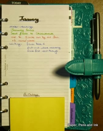
The next double spread is for ‘Goals this year 2014’ with lined pages. The year is in a different coloured font (as they have been in the reference calendar), which makes my OCD tendencies squeak a bit. The lines don’t go right to the edges of the page, have a line spacing of 5.5mm, with a page margin marked in a dark blue top and bottom.

Goals for the year

The following double-page spread has quarterly goals for 2014 (again, the year is in a different colour, as is the middle month of the three in each quarter).

Goals for the quarter

Then there is a Year Planner for 2014, with the months vertical and the weeks marked off (which is a nice touch), then a double-spread of international holidays for major countries. After that there is a double spread of international dialling codes for major countries and some of the cities within some of these countries followed by conversions for weights and measures. Again, maybe I am unique in this, but I never, ever refer to any of these pages and would prefer to have more space for notes. Again – let me know in the comments if you do use these?

Year planner
Information pages
Information pages
Information pages

There then follows a double-page spread titled ‘How to use this planner’, but my personal feeling is that the order isn’t quite right (forgive me Laurie!). My personal preference (and I realise this could be just me) would be to put all the reference stuff either at the back and let people dive right in with the planner (if the reference stuff has to be there at all), or right at the front and then have the ‘How to use this planner’ and THEN have the goals for the year, quarterly goals etc. rather than break up the year goals to quarterly goals to monthly plans flow. This could of course be a reflection of how I set my planners up of goals to next actions to monthly lists.


The ‘meat of the planner’
a) the monthly section:
There is a double-page spread for each month with lined paper to list your goals for the month. These would naturally flow from the yearly goals (and quarterly goals) and which is why I think then breaking this flow with the information pages and ‘how to’ page isn’t quite right. The goals pages are then followed by a double-spread monthly calendar, with a grey-shaded column to the left of the week and the weeks starting on Monday. Each day-box is 30mm wide by 37.5mm tall (just under 1.25” x 1.5”) with the date clearly in the top left-hand corner and any holidays printed in a fairly small font across the top. Thankfully, the ‘New Year’s Day’ doesn’t then list all the countries for which January 1st is New Year’s Day (as Moleskine and other diaries do, which takes up the ENTIRE box!!).

Monthly goals
Monthly overview

The monthly pages follow one month after another in a section, after which is:

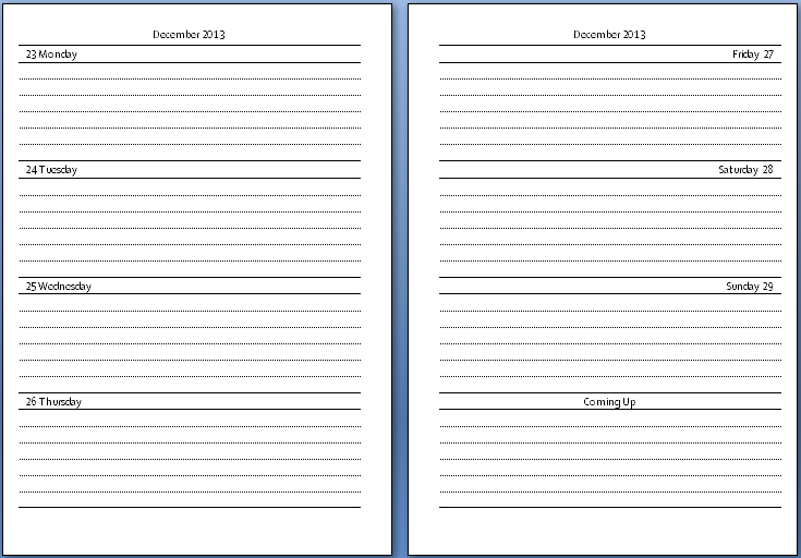
b) the weekly section:
The layout of the week-to-view pages is a grey column to the left of the week, then equal-sized (30mm) columns for all of the week (no squashed weekends) starting on a Monday. The day-columns don’t extend to the bottom of the page and are untimed, but are lined. Across the bottom is a large, unlined space for extra notes, with one of those days:dates calendars for the month in the bottom right-hand side. At the top of the left-hand page each week is a motivational sentence/advice for sticking to your goals.

Weekly layout
Motivational quotes

Now, for me, the vertical layout will be a challenge. Whereas I LOVE the vertical layout for my work diary, in my personal diary I have never got it to work. My work diary is a vertical week on a page and a bit with a notes section on the right (you can see the layout here) but in all my filofaxes or other planners I have always preferred a horizontal layout for the week. I think it’s because for my personal planning, I have few appointments but lots to plan and so like a wide oblong to write in, whereas at work I have appointments that need blocking off and a big space for notes at the side. For this reason, I’m not sure how successful the planner would be for me. The yearly goals, quarterly goals and lined monthly goals pages will be brilliant for me, but the monthly spread of dates and the weekly pages will be a challenge.

c) back of the planner:
After the last of the weekly spreads is a double-spread year planner for 2015, followed by two pages for an annual review and four pages for notes. The very back page has some information about Laurie herself.

Year planner for 2015

Annual review pages

Notes pages

Back cover

d) the pocket in the back cover:
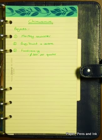
There is a slip pocket in the back cover with a notes-book in it. The pocket is made of the same, thicker paper that lines the planner, with a glossy inner to the pocket. As I understand, last year the little booklet in the planner was an address-book, but this year it is a notes-book. The notes-book is 109mm x 180mm (4 6/16 x 7 10/16 inches), has a front page for the same personal information as the planner then 15 sides of notes pages, lined with a very narrow 4.75mm line-spacing (3/16th inch).

Notes book

Inside notes book

Notes pages in the booklet

Flattability:
It might get better with use, but at the moment it is pretty resistant to lying flat and is in no way bat-like in its flatness. When the book is open in the middle, the cover is lying flat but the pages are a bit ‘sprung’ and writing in the day columns for Wednesday and Thursday will involve a bit of brutality to make it easier.

Ribbon markers:
Regular readers will know quite how much unmatched ribbon markers and elastic closure annoy me and make my OCD tendencies squeak. The two ribbon markers in the Plannerisms planner are green/teal and black. The black complements the planner beautifully and the green/teal is a close enough match that I’m not upset!

I haven’t done a fountain-pen test for a couple of reasons. One: I hate spoiling books by doing them and prefer it if I can just remove a page to do the test (which I can’t here) and two: I’m not ready to write in it yet as I am still in the I-don’t-have-a-clue-what-my-goals-are fog. I will update this/report back once I have.

Overall:
It’s not the perfect layout for me, but it is a really beautiful book and very well thought-out. It is a great size and weight (300g) if you wanted to carry it around – it certainly weighs a lot less than my Baroque filofax (which is currently 585g, though this is my wallet as well as my planner). My preferred layout would be the week to view with a horizontal layout rather than vertical and I wouldn’t separate the yearly and quarterly goals from the monthly and weekly section. Personally, since I never use them, I would also replace all of the information pages and the year calendars with more notes pages (but I recognise I am probably in a minority over this!). At some point I will work out how to use the monthly spreads too (but the monthly note pages are brilliant!).

Thank you again to Laurie for sending me one of her planners to review!

You can order a Going Places Planner here.

Saturday 30 November 2013

Review of the metal-cased J Herbin rollerball

Slowly crawling out of hell... always helped by a parcel containing stationery arriving (and listening to the glorious Julie Fowlis).

So, what have I bought now? Actually, something I have bought before – a J Herbin rollerball from Bureau Direct. I reviewed the others here. This one however, is the metal cased version. The pen takes standard-sized cartridges and costs £18.95 for the pen and two tins of J Herbin cartridges (which come in THE most adorable tins!) or £14.95 for the pen alone. Bureau Direct are doing a ‘12 days of Christmas’ series of offers at the moment and one of the offers was to get the pen but with three tins of cartridges instead of two (the tins are £2.25 each tin to buy on their own).

J Herbin rollerball with metal casing

In my original review (about a year ago) I said that the pens were a bit scratchy to write with. I’m pleased to say that the one I loaded with bleu pervenche ink 11 months ago and have used daily since (it’s slotted into my 5-year diary. That’s how I know I’ve used it all year!) has stopped scratching and squeaking when I write. The one loaded with Lie de Thé is still a bit scratchy, but hasn’t been used anything like as much. The metal-barrelled one doesn’t squeak or scratch at all and is a nice weight in the hand.

All opened up and with Larmes de Cassis cartridge inserted

I asked for three tins of Larmes de Cassis ink with the pen. My favourite coloured ink by J Herbin is Poussière de Lune, but since I have a bottle of that and a syringe and wide-bore needle thing for refilling cartridges, I didn’t see the need to ask for tins of that colour and the Larmes de Cassis looked lovely. I’ve written a bit with it and, like the original pens, the line laid down is fine and the ink is wet enough to be decently dense but not too wet. The colour of the Larmes de Cassis is (unsurprisingly!) a bit like Ribena!


Overall:
Bureau Direct are brilliant (as ever! No affiliation; just a perpetually happy customer!) and the pen is great. It looks so much smarter than the original versions and I LOVE the ability to use a rollerball but it take nice ink cartridges. 5*