The three notebooks come in a blue and silver box which is delightful. The actual notebooks themselves have fairly plain covers.
[click on any picture to enlarge]
Outer box:
 |
| Still in wrapper |
 |
| Back of box (still in wrapper) |
 |
| Unwrapped (foil is silver, not gold as depicted here!) |
 |
| Top flap of box opened |
The notebooks:
The notebooks are 9.5cm x 14cm and glue bound. The binding makes the usable size of paper closer to 9cm x 14 cm. There are 32 pages (64 sides) and the corners are rounded.
Where do they sit in the Functional/Pretty grid? Well... the outer box is indeed very pretty and attractive. The covers of the notebooks themselves are fairly dull with nothing more than a stamp saying "property of" and a space to write your name. The navy cover would struggle to show the name unless you write it with white/silver pen. So, cover wise, they would be sitting at the opposite end from "pretty". They're not unattractive, but you're not going to go "ooh!" the way you might have with the Papio Press books, for example.
 |
| Inner flaps of box opened |
 |
| Covers of the 3 notebooks |
The pink-brown notebook has lined paper. There is a double margin on the left. The very first page was tightly glued to the cover so on that first page, the two columns looks the same size. After I removed the first page (see below), the pages have 12mm and 5mm spacing (L to R). Line spacing is 6.3mm with a top margin of 13.5mm and 19 lines per page.
 | |||
| Lined notebook |
The white notebook has plain paper inside.
 |
| Plain notebook |
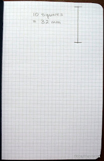
The navy notebook has graph/squared paper. The squares are 3.2mm which is pretty small!
In all notebooks, the first page was tightly glued to the cover. On the back cover there is the Write Notepads & Co. logo with "Makers of fine stationery notebooks" underneath (sorry, forgot to photograph).
Pen tests:
As you all know, the deal-breaker for me is how they perform with fountain pens. I used the first page of the lined notebook to do my pen test and then removed it (with difficulty) to be able to photograph the reverse more easily.
General writing feel:
It was quite smooth to write on, ink flow was good and the paper was neither too shiny nor too toothy. I would rate the writing experience quite highly.
5*/5
Feathering:
There was some feathering. Nowhere near as bad as the squashed spider appearance I got with a Peter Pauper book but there was definitely some. Not so bad that you would spot it instantly apart from perhaps with the Conklin (which does lay down a lot of ink).
3.5*/5
For comparison - the Peter Pauper book:
 |
| Squashed spiders! |
Show-through:
The show-through isn't the problem.
4*/5
Bleed-through:
The bleed-through is the problem! Every ink bled through to some degree or another, with the Conklin the worst (but that is as expected). Okay, the reverse is usable, but for a notebook that claims to be good for fountain pens, I would have to disagree.
3*/5
 |
| Significant bleed-through |
Flattability:
Well, you can break their spines and then they lie flat. Sort of. And then they spring back up anyway. I don't really like books that are this tightly bound as I hate having to fight a book to write in it.
1*/5
Overall:
The outer box is very attractive; the covers of the notebooks themselves are nothing special. The writing experience was a bit mixed - the paper is nice to write on but the combination of the lack of flattability and the significant bleed-through was less good.
My thanks to Stuart at Pocketnotebooks for sending them to me to review.
Disclaimer:
I was given these notebooks free to review. However, this is an honest review and not influenced by them being a gift.


No comments:
Post a Comment