 |
| Quo vadis ABP 2 diary |
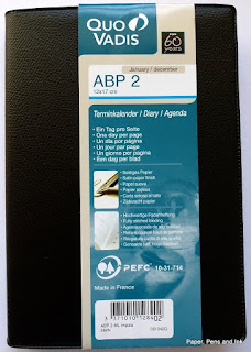
Today's review is of the Quo Vadis ABP 2 daily diary for 2016. I bought this to use as a better quality version of the reporter's notebook that I've been using as my day-planner! In the reporter's notebook, I've drawn a line down the middle of the page, added times to the LHS and then used the LHS to time-box activities and the RHS for to do lists, notes and so on. This has been working brilliantly (except on weeks when family crises occur and throw all my planning out the window...), but I thought I would try a 'proper' daily diary with a similar layout for next year.
Enter the Quo Vadis ABP 2.
I ordered mine from Bureau Direct (no affiliation, just a long-term, happy customer) and asked for the black cover. It arrived (as ever from Bureau Direct) well packed and very promptly. Click on any picture to enlarge.
First impressions:
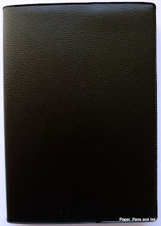
1. It comes with a vinyl cover in a 'pebbled leather' effect. That's hideous and I'm going to be removing it. I may put the diary in another slip cover, but I may just leave it coverless. It isn't a diary that will be going out and about with me, it will just sit on my desk. If I feel really inspired, I will re-cover it.
 |
| Pretty hideous cover |
 |
| With vinyl cover removed |
2. It probably won't lie flat without some brutal treatment. Which is fine as I have been known to be brutal with things to make them lie flat! It's disappointing in many ways though as I think it might annoy me. The alternative (if it really won't lie flat) will be dismember it and put it in a ring-binder.
3. The line spacing is tiny! We're talking 3.5mm line spacing!
 |
| Seriously narrow line spacing! |
4. Apart from the line-spacing, the layout is great! It has timed slots down the LHS which I can use for time-boxing and space on the RHS for notes, to-do lists etc. There is also space at the bottom for other jottings (and sadly, one of those daft little calendars that are neither use nor ornament, but hey ho).
5. There are tear-off corners so you can flip to the right day without needing a bookmark.
6. There is a plethora of languages on each page which makes it a bit busy
7. There are maps and other information pages. I will probably use the address pages as space to write my monthly goals (or ignore them altogether...). The maps I might colour in if I'm bored. I never really need most of the extra pages in a diary to be honest! I know others love them though.
 |
| Front page |
 |
| Info page |
 |
| Holiday dates (to fill in) 2016 calendar |
 | |
| What a double spread looks like (Saturday and Sunday get a page each) |
 |
| 2017 calendar First of several maps |
 |
| More maps |
 |
| Address pages |
 |
| List of Public Holidays for 2016 (plus signs of my brutality, making it open flat!) |
I haven't done any pen tests on it yet - I'll post again when I have.
Does anyone else use this format? How have you found it?

I've used the American version of this - APB1 - the same as this, except no foreign languages (so less cluttered), and the lines are just a little bit wider apart. I loved using it in my last job, when most of my planning was at the daily level and my work/personal life were pretty integrated - I could use the timed column to keep track of appointments and how I was spending my time; it was helpful for me to block out time for tasks by blocking the times out visually. It also let me keep detailed to-do lists by each day - if I didn't complete something from one day, it went to the top of the next day's list. Then I had a great record of what I'd done (or hadn't) over time. I personally love narrow ruling, and I also loved that it has separate spaces dedicated to appointments and notes/to-dos. I even liked the little mini calendars, because they gave me as much info as I needed to look ahead while on the daily page.
ReplyDeleteI don't use it any more, because now I I keep my work/personal planners separate. So I don't need a full day of appointment times/to block out my day in my personal planner, because M-F it would just be 8:30 to 5:30 blocked out for work and all my personal stuff would be squished around that. I also don't need that much space for to-dos in my personal planner. And at work I need to be able to see my week at a glance, and to keep to-do list more by projects than by date, so I use something else for work/home now.
But I did really love the APB1 - the paper was great and the ruling exactly how I liked it (again, a little less narrow that the 2). If I were still working the less 9-5 job and mixing work/personal life like I used to, I'd totally be using it still. I'm not sure I ever got it to lie flat on its own (but that bothers me less than ring binders).
Hi there!
DeleteIs the APB1 a bit bigger? This one measures 12cm x 17cm (4.75 x 6.75 inches, roughly). I would have got the APB1 but I can't find it for sale in the UK...
I think this one will work well, because by the time 2016 rolls around I will be (deliberately) unemployed!! (a.k.a. self-employed writer)
:-D
I'll still use the Traveller's Notebook for the week at a glance overview, but the day to day planning should go well in this.
Thanks for stopping by and commenting!
The ABP 1 is bigger. It's 5.25 x 8.25 inches. The paper does allow quite a bit of ghosting but no bleedthrough with an EF Kaweco nib.
Delete