Thursday, 31 December 2015

Quo Vadis Forum Journal/Page per Day Challenge #1

Recently, Quo Vadis ran a raffle to win one of three of their diaries (Journal 21, Notor or undated daily), in which to do the Page Per Day Challenge. You can see the blog posts about the challenge on the Quo Vadis page here.

I entered, and asked for the undated version because I liked the layout of it more than I did the others and I'm glad that I did indeed receive one of the undated daily versions. Free stationery is of course, free stationery, but I wouldn't have been happy to get the Notor and would probably have emailed back and asked them to give it to someone else if they'd said I'd won one. The Journal 21 would have been okay, but I genuinely did want the undated daily!

It arrived yesterday thankfully, as I was worried that the New Year would start before the diary had arrived. Here it is, still in the shrink-wrapping:

Exacompta Forum Journal picture
Exacompta Forum Journal

And here it is unwrapped - front...

Exacompta Forum Journal picture
Exacompta Forum Journal front (with label)

...and back...

Exacompta Forum Journal picture
Exacompta Forum Journal back (with label)

The size of it is great! It's 5" x 7" which is big enough to write a reasonable amount, but small enough that I will have to think about what to record.

Inside:
First up is a title page which just says Forum with the branding at the bottom right:

First page

After that there is a page for putting personal details and the first of a few information pages:

Personal information; weights and measures

There is then a double spread of dialling codes for places in the USA:


Followed by a map of the USA and dialling codes for countries around the world:


After that the diary starts. I haven't dated it yet, but I think there could be 366 diary pages... and 2016 is a Leap Year.


Right at the back is a page for travel expenses and then a few pages to record addresses and phone numbers etc.


Page layout:
I liked this diary for journalling because there is a space at the top to record any events/appointments, but the rest of the day is free and simply lined paper. The other two on offer - the Journal 21 and the Notor - had more detailed layouts. The Journal 21 has a space at the top of the page with a mini diary tucked to one side and the rest of the page has timed slots. The Notor has a very busy layout with blocks of colour that hurt my eyes. Enough said.

Nice, straightforward layout


The paper is 64 gsm, acid and chlorine-free. I'll see how well it behaves with fountain pen. I really hope it will be okay. The Quo Vadis ABP2 isn't bad but there is some show-through with some pens.

The bottom corner of the page can be torn off to mark your progress through the book, which is good, because there is no ribbon marker. I will possibly add a ribbon marker to it, not least because I have some lovely charms that I want to use!

The cover is simple kraft card with a leather effect that reminds me of the Clairefontaine Age Bag notebooks. Unlike the other two diaries in the giveaway, there was no cover included as well as the diary, but that's fine - I like the plain kraft one (I threw away the one that came with the ABP2 as it was so horrible but if I hadn't, it would have fitted it I think).

It has sewn binding which means that it should lie flat. That said, the ABP2 has sewn binding but only lay flat after I broke its spine in several places. Initial opening of this indicates it lies a bit flatter than the ABP2 but not flat-as-a-bat.

Overall, I think it's a great little day per page diary. I'm struggling to find stockists for this, including on the Quo Vadis site (but maybe I'm looking in the wrong places). If anyone knows where it can be bought, let me know in the comments? Thanks!

I shall be doing updates on how my journalling goes, as part of the Page per Day Challenge, so please do come back and see how I get on. Is anyone else taking part? Let me know and I can do a regular round-up of posts, if people want.

Wednesday, 30 December 2015

Planning 2016

2016 is going to be a busy year for me! My first book, The Wrong Kind of Clouds is due out in spring and there will be a lot of things needing to be done relating to that (you can see all my posts about that here). Then I have at least two books to edit and get ready for publishing, and somewhere in all that, I have to write the book that is threatening to eat my brains if I don't get it out of my head and on to paper! Oh, and it seems life doesn't stop, just because you're busy, so there's also all the general 'stuff' that needs doing, in order to live.

Thankfully, I've always been a pretty good planner. Even more usefully, I have a cupboard full of notebooks and paper, because I am an unrepentant stationery buyer and hoarder. My only problem is that I can find it quite hard to start a notebook!

However, one of the delights of this time of the year, is to get out a selection of notebooks from the stash and choose one to use for planning. When I say 'selection' I do of course mean the equivalent of a small stationery store.

So, I merrily pulled out a collection of notebooks and wondered which, if any, would be right for planning such a busy and momentous year.

And that's where the problems started...

In the past, I've tended to use a Filofax for general planning, mostly because of being able to move pages around within the binder. With a Filofax, I can have different sections for different projects and add/remove pages as and when needed. But, I fancied a change. I wanted to have my notes bound together rather than loose-leaf, because this year isn't just any old year getting planned. This is the year I actually get to call myself a published writer!

Most of my notebook stash are bound books and I initially thought that these would be excellent to plan and record 2016. Excellent! A bound summary of the year, tying together the planning and the results.

Two minutes' thought later...

How was I going to do this? Did I put all my goals at the start and then just fill the pages as I went along? Aagh!! I don't have the right character for that! All the notes on a single project, scattered through a book? No. My brain started turning into grey goo at the mere concept.

Could I leave gaps between the different projects so they each had 20 pages or something? Oh, but what if I needed to write more on something and then ran out of pages? Then I'd be back to notes being all over the place.

Then it occurred to me that I could have the flexibility of a binder but keep all my notes for a project bound together, by using a Traveller's Notebook. Then I could have a separate booklet for each project, which would give me the flexibility for adding new notebooks if needed (or abandoning them) but still let me have all my project notes in one place.

Hurrah!!

Except the one I have, is currently used for my wallet and day-to-day diary combined.

Quelle dommage... I would need to buy another...

So, that's what I've done!! More on it once it arrives!

Monday, 21 December 2015

New purchases

Just because I've been working away at other stuff, doesn't mean I haven't been buying stationery. Oh no sir-ee! In fact, some (DH, for example) might call it a splurge!

I've recently become the owner of:
  • a Nemosine Singularity Demonstrator with M nib
  • a Jinhao X450 fountain pen with M nib
  • a Leuchtturm package from Bureau Direct of A5 Leuchtturm notebook, pen loop and Palomino Blackwing pencil
  • an A5 Life Noble notebook with squared paper
  • a bottle of Diamine Ancient Copper ink


Today: the two new fountain pens. As ever, click on any image to enlarge.

1. The Nemosine Singularity Demonstrator with M nib

Box (front)

I bought this via eBay for the princely sum of just under £15 including shipping from the USA. It came in a box and the pen can take either short international standard cartridges or can be converted to use bottled ink. The converter came with the pen, as did 6 cartridges. The pen has a 3-year perfection warranty, though as you need to pay postage of the item to and from the USA plus $5, it's probably not worth it unless you are IN the USA.

Box (back)

As it's a demonstrator, the barrel is clear. The cap unscrews; the converter is a push-fit. The nib is quite long (approximately 23mm of it pokes out from the barrel; same as the Conklin Durograph) and the tip is glass smooth. The M nib is on the broader side of medium. If you prefer a finer line then this might be too thick for you.

Nemosine singularity demonstrator
Nemosine singularity demonstrator (cap removed)
Close up of the nib

In the hand, the pen is lightweight and nicely balanced. The large nib has sometimes made the pen feel like it's in a slightly different place in my hand, but I've quickly got used to it, presumably because I've got used to the Conklin. It's an acrylic barrel and so is pretty light. I've done pages and pages of notes with it (at least two refills of the converter) and have loved writing with it. It's not quite as nice in my hand as the Conklin Durograph (nor is it as pretty!) but it's a great pen and I can recommend it.

2. The Jinhao X450
This was also bought on a whim from eBay and was a mere £3.99 including shipping. No box, just a Jiffy bag, but then, it was £3.99. I went for the red and gold lacquer-effect and it's very attractive. Again, it came with a converter but could also take short international standard cartridges I think. I have used the converter.

Jinhao X450

The cap is a click-fit and feels very secure. The nib is comparable to both the Nemosine and the Conklin at 22mm. It too is very smooth and the line that it lays down is slightly finer than the Nemosine. There is a slightly moulded grip but it isn't as irritating or as pronounced as the Lamy pens.

Jinhao X450, cap removed
Jinhao X450, converter shown

Jinhao X450 close up of the nib

However... the thing weighs a tonne! The weight distribution in my hand feels all wrong and I find I'm gripping it tightly so my hand cramps up. It is not a pen I enjoy using! It is going to a new home.

Nib comparisons:
All three have large nibs! I'm getting used to that, but it's something to be aware of if you're used to a more petite nib. The measurements given in the image below are from the edge of the grip where the nib emerges, to the tip of the nib.

Top: Conklin Durograph (nib size = 23mm)
Middle: Jinhao X450 (nib size = 22mm)
Bottom: Nemosine singularity (nib size = 23mm)
Line comparisons

In summary, I would say that the Nemosine is a cracking good pen - light in the hand but not too thin (thin pens can make my hand cramp up too) with a fabulously smooth nib. The Jinhao X450 probably suits somebody but it doesn't suit me because it's too heavy. It's nicely made, attractive looking and has a smooth nib, but my hand feels horrible after writing with it and since my 'job' now is writing, I have to feel comfortable with my tools of the trade! The Nemosine is a keeper; the Jinhao is going to a new home.

Monday, 14 December 2015

My SNC Traveller's Journal: aka The Workhorse

SNC Traveller's Journal ("The Workhorse")

I've been using my Traveller's Journal from the Stamford Notebook Company since July. I've made a couple of modifications along the way, but I'm still using it every day, which for me is a major change! Normally I'm chopping and changing Filofax binder/size/style more frequently than I can keep track of! To still be in the TJ after almost 6 months and with every intention of staying in it, is amazing.

So, what's in there? How have I got it set up? And why is it working so well?

The Cover:
The original cover had a leather thong closure which wound around a button on the front, but the leather was a bit too thick and it didn't feel as if it was closed tight. I fairly quickly changed it so that there is a loop of elastic secured with two buttons to the back of the cover. It's still a bit bulky but it's not annoying me enough to change it! I still love the button on the front and the leather loop just hooks over it and holds everything closed.

My button/elastic loop modification
Back cover - beginning to get a few scars...
but still gorgeous

Originally, the booklets were held in by leather thongs too, but again, they were too thick and bulky so I replaced them with elastics threaded through the holes for the thongs. I currently have four elastics in, though am contemplating putting another two in.

What's in there? How have I got it set up?
Around the first elastic are the zipped pocket (Midori 008) and the card holder (Midori 007). I blogged about both of them here. The zipped pocket holds coins, the card holder unsurprisingly holds cards and the other half of the zipped pocket insert holds paper money and receipts. I originally had these on two separate elastics (as shown in the picture) but now they are both slung around the first one.

The paper is hiding my cards! The planets washi is the edge of the diary.

The zipped pocket insert is great; the card holder holds cards quite loosely to be honest. If the slots faced outwards rather than inwards, I may well have lost cards. They seem to stay in solely because the openings are next to the elastic so there's a limit to how far out the cards can come. Some of this slackness is ameliorated by having more than one card in the slot, but even then, some of them are a little loose.

Next up is a home-made monthly insert for the last few months of 2015. Entirely as expected, I'm not looking at it and it isn't actually helping me to schedule tasks any better than just leafing through the weekly diary and seeing how much is already going on in a week. I'm probably going to take it out because it's taking up an elastic that I want to use for something else!

After that is the week plus notes diary that I made myself from the Moleskine squared cahier. You can see the layout here. (Interestingly, right at the start of that post, I said I would be staying in the Adelphi for the rest of 2015. Uh huh?)
Clipped to the back cover of the diary is a Stamford Notebook Company week + notes insert that they sent me for feedback. They sent me both a week to view (all of 2016 in one booklet) and the week + notes format (2016 split over two booklets). It's not quite the layout that I want as I've got used to the 8 boxes on the left and squares on the right, but it's not bad. I've divided each of the left-hand pages with a vertical line so that I can put appointments on the left and tasks for the day on the right. The right-hand page is a bit free-form as a single lined page but I'll see how I get on with it. I may divide that vertically too. This will move on to an elastic of its own when I ditch the monthly insert, but at the moment, it's held in place by the sweetest clips from OHTO. Who doesn't need a smile?

OHTO smiley slide-clip
SNC 2016 week + notes diary (cover)
SNC 2016 diary - first page (year diary)
SNC 2016 week + notes diary - interior.
I added the vertical line on the left

Right at the back is another horrible Moleskine cahier which I'm using as a notebook - general jottings, things to look out for, reminders etc.

Why is it working so well?
I've always used a ring-bound planner before and frequently struggled with the size of one - how to be big enough to hold what I wanted but not so heavy it was a pain in the neck to take everywhere with me. The TJ is pretty much the perfect size. I can easily trim A5 inserts if I needed (and have done so with Rhodia cahiers which are ready and waiting in the cupboard for when the horrible Moleskines have been used up). It is also pretty minimalist - the covers are sturdy without being bulky and although I have several booklets and inserts in there, it doesn't feel like a giant lump when I'm out and about. The diary size is large enough that I can probably work just from the week + notes and not need the day-planning that I do in a reporter's notebook (but the extra space in a day in that allows me to time-box).

What will I be using in 2016?
Well, as you'll have seen from my last post, 2016 should be an exciting year. I will also be spending the whole year 'working for myself' rather than working at the university and so (as I am now) in charge of my time to a much greater extent than ever before. Whilst this has many benefits, it's also a responsibility and my planning system will need to work as well as it ever has.
I'm anticipating using the TJ with the week + notes, with longer term plans held in another notebook that can live at home. In conjunction with the TJ, I'll be using the day per page Quo Vadis APB2 (which I reviewed here; then I broke its spine a lot so that it would lie flat and posted pictures here).

I'm honestly quite impressed that this system has been working out so well for me. I genuinely wasn't sure if I would transition to a multiple-booklets system from a ring-bound one very easily. So far, so good though!

Friday, 4 December 2015

Exciting News!

The observant (and even the less observant!) may have noticed that it's a month since I last posted. The main reason for that is that I've been working on another very big project!
Some of you know what this is, but for those of you that don't, my big news is...

My first book is getting published!

[It's not actually the first book I wrote... that will probably never see the light of day. It's not actually the second either, but it's the first of my books to be published!]

It's being published by Matador and a lot of the last month has been taken up with 'stuff' to do with becoming a published author (that still feels weird to say...). Writing the book was almost the easiest thing!

Anyway, I now have an author website (please go and check it out and let me know what you think... www.amandafleet.co.uk); an author Facebook Page (https://www.facebook.com/AmandaFleetWriter/) and a Twitter account (@amanda_fleet1). I also have a very preliminary entry on the Matador online bookshop, which you can see here.

It's been a bit of a vertical learning curve to be honest, but I feel like I might just about be getting to the point where my feet don't feel like they're about to slide out from underneath me.

Don't worry, I will still be reviewing paper, pens and inks on here, but if you're wanting to share my journey as I move from unpublished author to published author (ooh, that does still sound good!), you can sign up for email updates, over on www.amandafleet.co.uk (there won't be any spam - you'll just get an email when I post something on that website).

Yes, I'm still happy-dancing about it all!

Thursday, 5 November 2015

Shimmering Inks

There have been a number of shimmering inks appearing recently. These are inks that have particles of metal dust or other fine particles that will catch the light.
There was the much announced Emerald de Chivor by J Herbin (green with gold) which joined the other inks in their 1670 range - stormy grey (grey with gold), ocean blue (blue with gold) and rouge hematite (red with gold).

Then a few weeks ago, Diamine announced their new Shimmertastic range which has ten different colours - Magical Forest (green with silver), Night Sky (black with silver), Blue Pearl (dark blue with silver), Brandy Dazzle (cognac colour with gold), Purple Pazzazz (purple with gold), Golden sands (deep yellow with gold), Sparkling Shadows (dark grey with gold), Blue Lightning (turquoise with silver), Shimmering Seas (purple-blue with gold) and Red Lustre (red with gold). The picture below is taken from their press release at Goulet Pens (apologies for my watermarking obscuring their logo!).

Anyway, despite already possessing more ink than I can possibly get through in a lifetime, I decided to treat myself to some of these shimmering inks. I've got six in total - three by J Herbin and three by Diamine. I reviewed the three J Herbin inks (see here) but I thought it was high time to do a compare and contrast.

The three J Herbin versions I have are: Emerald de Chivor, Ocean Blue and Stormy Grey. The Diamine inks are: Blue Lightning, Blue Pearl and Night Sky.

Price:
The J Herbin sparkling inks are on sale at Cult Pens at the moment at £14.59 for a 30ml bottle (no affiliation, just a happy customer). The Diamine Shimmertastic inks are £8.95 for a 30ml bottle (also at Cult Pens) - about 60% of the price of the J Herbin inks.

Performance:
I have three pens inked up with shimmering inks but I wanted to compare all six that I have. I have a glass dip pen and so I did the same thing with each ink - shook the bottle for 20 seconds to ensure the sparkly bits were well distributed, dipped the glass pen in to the same depth, then wrote the name of the ink and the ubiquitous The Quick Brown Fox... sentence. All the samples were written on Original Crown Mill white vellum paper. I tried to photograph each sample from above and from the side.
Man, these were hard to photograph!! Not helped by it being a grey day in Scotland, but even so...
Each ink sample is shown photographed from above and then from the side. Click on pictures to enlarge.


I also tried the three pens that are inked up and wrote (pretty much) the same thing:


So, what do I think? Let's take them brand by brand and then ink by ink.

J Herbin v Diamine:
The J Herbin are more expensive than the Diamine and the quality does show through to some degree. I don't know what it is about the J Herbin inks though, but they creep everywhere! I think that they must have a different surface tension to other inks, allowing them to climb surfaces and just generally get everywhere! I'm not the only one who found this - I sent a sample of the Emerald de Chivor to a good friend and he said it got everywhere too! That's not just a disadvantage because you get inky hands when the pens are refilled, but also the inks penetrate through (some) paper quite significantly - even paper that has been pretty resistant with other inks and never shown a problem before. They also have a tendency to feather more - you can see it to some degree in the samples written with pens - and lay down a thicker line.
Diamine ink doesn't seem to have the same property but the disadvantage seems to be that after not using a pen for a while, it is resistant to start writing. The Night Sky in the Sheaffer calligraphy has been fairly problematic with variable feed and drying out, whereas the Ocean Blue (also in a Sheaffer calligraphy) has started first time, each time. There's no getting around it - the J Herbin inks are wet to the point of sopping whereas the Diamines are on the dry side (at least in my pens).

Ink by ink:
1. Ocean Blue
I like the density of the colour but to me, the sparkliness of the ink seems quite limited on the Crown vellum. I would be hard pushed to spot it, even when using a calligraphy nib and a litre of ink is being laid down with each stroke (okay - I exaggerate, but it seems a bit that way!). However, when I reviewed my J Herbin inks a while back, this looked incredibly sparkly! I think all of the inks are paper-dependent for showing off their true values. (The previous reviews used Tomoe River paper)

2. Blue Pearl
Again, a lovely depth to the colour and more sparkle to it than the Ocean Blue on this paper. I also slightly prefer the silver and blue combination as opposed to the gold and blue combo, but that's personal taste.

3. Stormy Grey
In contrast to the Ocean Blue, there's almost too much gold coming through in this one and it makes the grey look yellow. Others may love that, but I'm less of a fan. Unless the light really catches the gold and makes it sparkle (which, I note, it did in my earlier review), the grey can look a little jaundiced.

4. Night Sky
The black and silver combination (with a hint of purple in the right light) is just gorgeous. The downside (but it might be pen-specific) was that when I filled a Sheaffer calligraphy with this, it took an age to get started, then had pretty poor feed, before finally getting into its stride. I then left the pen alone for a day or two and it's dry and reluctant to start. The level of shimmer on it is good and there aren't the feathering and bleed-through issues of the J Herbin.

5. Blue Lightning
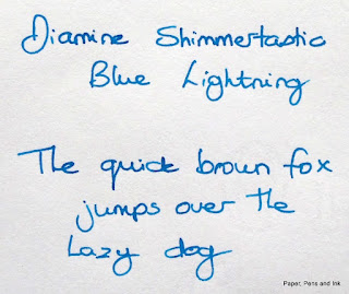
I used this to write to a friend and neither of us were overwhelmed by the sparkliness, although both thought that the turquoise was a very pretty colour. However, it might have been the paper that I was using (airmail) as when I wrote on different paper, the silver shimmer was much more evident. It's still subtle, but with the right paper this is a very pretty combination.

6. Emerald de Chivor
I do love this ink! It's a wet to sopping ink but that allows the depth of colour and shading to show through as well as the sparkles. There seems to be more colours in the ink, beyond merely green - blues, reds, yellows - depending on the line thickness and amount of ink laid down. It's probably my favourite of the six sparkling inks, even if it has a tendency to bleed right through normally ink-resistant paper.

In summary:
Both sets of ink are great. The J Herbin are perhaps a slightly better quality - I would like to compare and contrast them with chromatography tests; I think there will be a bigger range of pigments in the J Herbin inks - but for the price, the Diamine are fabulous value. To get the full effect seems to be somewhat paper-dependent, with a glossier paper (such as Clairefontaine, Tomoe River etc.) giving a better result than more matt paper. Emerald de Chivor looks good on any paper but the others do seem to need to be on a paper where the ink sits for a moment, allowing the ink to dry and the gold/silver to end up on the top.