Sunday, 30 August 2015

Traveller's Journal - update

Stamford Notebook Co.
Traveller's Journal

I've now been using the Stamford Notebook Co.'s Traveller's Journal since June 15th so it's time to tell you how well it's working out. I blogged about the set-up here.

Order of stuff in the TJ:
At the front, I have the zipped pocket/two slip-pockets Midori insert (Midori 008, blogged about here). That's wrapped around a card-holder insert (Midori 007, blogged about in the same blog post).
I did have them around separate elastics, but then slipped them around the same one so the cards are in the middle.
Then there is a Moleskine (spit, spit, spit... horrible quality, NEVER buying them again) cahier with the week plus notes diary.
At the back is another Moleskine cahier (still spit, spit, spit, horrible quality, never buying it again) - this one is lined and is for notes.

How it's all been working out:
The home-made week plus notes diary (blogged about a lot - see here for main post) is working REALLY well. I may not continue blocking the RHS into eight zones next year, but I will continue to write next-action lists based on life areas. The only reason I might not block the RHS out into eight equally sized blocks is because I sometimes need more space on some things than I do on others.

Week plus notes diary
The tracking boxes are also working really well and remind me to do stuff I keep forgetting to do!

The notes cahier is also useful - I've always had a notes section in my Filofax, so no great surprise there.

The Midori inserts are okay. Because there's no pen holder in the TJ, I've popped an erasable pen (uni-ball signo TSI; freebie from Cult Pens!) in the zipped pocket and that's okay as long as I don't have a lot of cash. If I do have a lot of cash, the pocket gets a bit bulky with the pen in there too.
The cards can sometimes seem a bit loose in the card holder. They won't fall out, but sometimes they do move significantly towards the outer part of the slot. For a couple of them I've put two cards in because the slot really has seemed too loose and things were almost falling out. Likewise with the slip-in pockets (other side of the zipped pocket insert) - receipts almost fall out and the paper money in there feels like it's held very loosely. I'm contemplating getting something else to hold the wallet aspects of it all but I'm not sure what. Suggestions? (Remembering I'm based in the UK and shipping from the US can be prohibitively expensive).

What I do miss is an address book. Yes, I'm only needing to look for addresses at home and yes, I have them in a Filofax at home but for some reason I want them in the TJ. Though probably not enough to get an address book insert for the TJ! I know - go figure...

Other than those minor niggles, it's still working out well for me.

Tuesday, 18 August 2015

Quo Vadis ABP 2 - update

It lies flat!

It lies flat!!

Look away now if you like your stuff pristine...


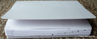
Okay. It was a bit resistant and so I broke its spine in a few several places and now it lies flat just fine.
:-)

However, it now looks like this:

A bit battered
Major spinal injuries!
Less pretty; more useful though

But, it lies flat!

So, for those of you who like the thought of the ABP 2 but wanted it to lie flat (and don't mind beating it into submission), then rest assured, it will lie flat!

I started near the start of the diary, opening it out (hideous cover removed) and flattening out the pages, then I decided that the best solution would be to go to the middle and work outwards. I found the middle of the book and then bent it completely back on itself so that the two covers were touching. This (naturally) broke its spine (something I would hate to do on most books!!). I then worked my way out, section by section, re-breaking the spine at each junction between sets of pages and again at the mid-point of each block of pages.

I realise this is quite brutal, but my stationery has to work for me! I didn't buy it to look at! I bought it so it would work! This wasn't going to work if it wouldn't lie flat. I don't care that it looks a bit really quite battered. It's not going to be out and about with me as it's my daily planner and will sit on my desk.

Has anyone else brutalised some stationery to make it work for them?

Monday, 17 August 2015

Quo Vadis ABP 2 - review

[Sorry for the lack of posts - a family crisis pulled me away from pretty much everything! All is well now though!]

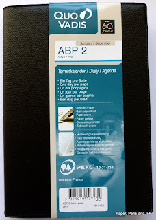
Quo vadis ABP 2 diary

Today's review is of the Quo Vadis ABP 2 daily diary for 2016. I bought this to use as a better quality version of the reporter's notebook that I've been using as my day-planner! In the reporter's notebook, I've drawn a line down the middle of the page, added times to the LHS and then used the LHS to time-box activities and the RHS for to do lists, notes and so on. This has been working brilliantly (except on weeks when family crises occur and throw all my planning out the window...), but I thought I would try a 'proper' daily diary with a similar layout for next year.

Enter the Quo Vadis ABP 2.

I ordered mine from Bureau Direct (no affiliation, just a long-term, happy customer) and asked for the black cover. It arrived (as ever from Bureau Direct) well packed and very promptly. Click on any picture to enlarge.

First impressions:
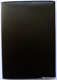
1. It comes with a vinyl cover in a 'pebbled leather' effect. That's hideous and I'm going to be removing it. I may put the diary in another slip cover, but I may just leave it coverless. It isn't a diary that will be going out and about with me, it will just sit on my desk. If I feel really inspired, I will re-cover it.

Pretty hideous cover
With vinyl cover removed

2. It probably won't lie flat without some brutal treatment. Which is fine as I have been known to be brutal with things to make them lie flat! It's disappointing in many ways though as I think it might annoy me. The alternative (if it really won't lie flat) will be dismember it and put it in a ring-binder.

3. The line spacing is tiny! We're talking 3.5mm line spacing!

Seriously narrow line spacing!

4. Apart from the line-spacing, the layout is great! It has timed slots down the LHS which I can use for time-boxing and space on the RHS for notes, to-do lists etc. There is also space at the bottom for other jottings (and sadly, one of those daft little calendars that are neither use nor ornament, but hey ho).


5. There are tear-off corners so you can flip to the right day without needing a bookmark.

6. There is a plethora of languages on each page which makes it a bit busy

7. There are maps and other information pages. I will probably use the address pages as space to write my monthly goals (or ignore them altogether...). The maps I might colour in if I'm bored. I never really need most of the extra pages in a diary to be honest! I know others love them though.

Front page
Info page
Holiday dates (to fill in)
2016 calendar
What a double spread looks like
(Saturday and Sunday get a page each)

2017 calendar
First of several maps
More maps
Address pages
List of Public Holidays for 2016
(plus signs of my brutality, making it open flat!)


I haven't done any pen tests on it yet - I'll post again when I have.

Does anyone else use this format? How have you found it?

Thursday, 6 August 2015

My Traveller's Journal Set-up

Stamford Notebook Company Traveller's Journal

Okay, so I bit the bullet (see this post) and moved into my Stamford Notebook Company Traveller's Journal. How have I set it up and how is it working out?

1. How have I set it up?
The SNC Traveller's Journal came with the booklets held in with leather cord and a leather cord to wrap around a button on the front to close it (see photo above). I've changed both of those. My inserts are held in with elastic cord. I've got 4 cords in total, threaded through the two holes (so yes, they are in the same place inside, but it's working without any problem - the inserts just move to the side). I found the leather cord too thick around the inserts so writing on the page was affected. It looked nice (and different to other Traveller's Notebooks/Journals) but it wasn't all that practical.
I've also swapped the leather cord that acted as a closure for an elastic loop that is secured to the back of the cover with a couple of buttons (to stop it falling off), but I may move back to the leather cord because I quite liked it. It's just that it makes a big lump in the back of the cover where the knot in the cord is and it's hard to write in the notebooks with it in.

Any organiser I use has to act as wallet, diary, planner and notebook or I'm lost. I've tried having them separate but I invariably leave the house without one and then find I need it. Hence the set-up I have.

First up are two Midori inserts - the zipped pocket and the credit-card holder. I have these around the first two elastics, with the zipped pocket first then the credit-card holder.

Coins go in the zipped pocket. I can't cope with not being able to see my coins now, having used a clear pocket for several years. I like to know when I go to pay for something whether I have enough change or whether I need to split a note. The zipped pocket insert is pretty sturdy and holds the coins well. I sometimes have my Zebra diary pen/pencil in here too as I haven't put any kind of pen loop in there yet.

Coins in the zipped pocket at the front

The other half of the zipped pocket insert has two slip pockets. I have paper money in one side and I put receipts and vouchers in the other side. For some reason, I thought I was short of card slots and so I put a stick-on one on the back of the slip-pocket. I could unstick it but I'm happy to leave it there!

Slip pockets. The paper behind them is to hide my cards

Next up are cards. I don't really want to show you them. I'm sure you all have enough imagination to be able to picture bank and credit and store cards in a plastic card holder. It holds three per side and 12 in total. I use one for stamps. The slots are quite loose and so some cards are doubled up.
 
Then comes the home-made week + notes diary in the (horrible) Moleskine cahier. The washi tape and sellotape holding it together are because I was slicing out some pages I had been experimenting on and sliced a bit too close to the spine! The stamps and washi are me just playing about. To be honest, I rarely even see the cover!

Paper is hiding my cards. The notebook on the right is my week + notes diary
The week + notes layout

I've deliberately photographed an empty week! But it hopefully gives you a bit of an idea about the layout. On the left are the days and a box for tracking things; on the right, the page is divided into eight - six life-areas (currently unlabelled), 'other' and 'next week'. Tasks and to-do items are assigned to one of the boxes and the next week box is so that I know what's coming up as I am pathologically incapable of turning the page and looking.

The day stamps on the diary side come from a set I bought from eBay. The Things to Do stamp came from Hema. I use the Things to Do stamp to write down my most important tasks for the day. The rest of my day planning is still being done in a reporter's notebook that stays on my desk. I use that to block off time for tasks and as a general scribble pad and then throw it away when it's finished. Despite having written the date range of the diary on the front cover, I'm likely to throw that away when it's finished too. Don't all gasp in horror. I keep a separate diary in which I jot important things about the day that I will want to remember in the future, and knowing that I needed to arrange a chimney sweep in such and such week is never going to be important to me and so stays in planners that I throw away when they're done. It's a planner. I plan in it. Once the plan is finished, why would I want to keep it?
[Sorry - I've never understood why people do, unless they are planning and journalling in the same thing, which is also a concept that defeats me - why would you want to muddle all that up?]

Anyway, moving on...

After the diary is another (hateful) Moleskine cahier that I am just using up to use up. I will never buy them again. I learned my lesson. I'm using it as a scribble pad. In it are going order numbers (crossed out when the item arrives), books to look out for, things to remember to do (noted down while I'm out and about; things that occur to me at home tend to go on the reporter's notebook page) etc.

Back of the week + notes diary (l); notes cahier (r)

Okay, that's the set-up...

2. How is it working out?
It's been working out really well so far. The footprint of the Traveller's Journal is bigger than a personal Filofax but the layout is working much better for me and the overall weight is about the same as a personal Filofax (though more than a slimline, naturally). The larger footprint is no problem as it's not really much heavier/larger than the Filofax and to be honest, the better layout of the planning bit more than makes up for it. Being able to see my weekly tasks, set out in the different life areas makes me see where I end up doing too much and what I still have to do in the week. Using time-boxing in the daily plan in the reporter's notebook stops me from overloading a day (and procrastinating!). It's all working pretty well at the moment.

Saturday, 1 August 2015

I STILL do not get monthly pages...

This week, over on Philofaxy, there were several posts in the list of Web Finds for August 1st that featured how to use the monthly spread. I read them keenly - the monthly pages are something I can NEVER get to work for me. Maybe seeing how others use them would help?

I still don't get them.

Absolutely NO disrespect to all of you who use the monthly pages and who make them work well for you, but I really cannot seem to make them work for me. I either want to put too much stuff in the boxes and then can't see the wood for the trees, or I put too little stuff in and miss it. Or I don't transfer information to my weekly pages. Since I have the rest of the year in my week to view (or week + notes) to hand, I would never put an appointment in the monthly pages - I would put it straight into the weekly ones. If it's for a date after the end of the year, I write it on the last page/in the notes pages and transfer it to the new diary when I have it.

If I need an overview of the month, I flip through the weekly pages. Each month, when I'm working out what I want to get done in the next month, I look at my next tasks/project lists and the pages of my weekly diary and allocate tasks based on how much is already in that week. I don't have many externally imposed deadlines, but I impose deadlines on myself and allocate accordingly. Birthdays get written into the weekly diary when I buy it and reminders to send cards/presents/arrange something are put in the weekly diary, the appropriate number of days before the birthday.

When I plan out my week, I use a combination of the weekly pages and a daily scratch pad to sketch out my days. I allocate tasks to each day when I do my weekly review (usually on a Sunday) and then at the start of each day I draft out, using time-boxes, when those tasks will get done.

I have tried and tried monthly pages! I've tried them in my Filofax to be able to reduce the number of weekly pages that I need to carry, but I just hated it - the boxes were too small. I've tried sketching out a month on A4 squared paper so that I can have it on my desk to make me see what I have on for the month, but I then pile books on top of it/don't fill it in/feel as if the whole month is empty because not enough detail of my day to day schedule is on there...

I've come to the conclusion that if it ain't broke, don't try and fix it and despite admiring those who can really work the monthly pages, I have had to accept that I will just not be one of them!

Anyone else find the monthly sheets difficult to work out? Or am I alone on this??