Thursday, 27 September 2012

The Mulberry agenda - one month on

Well, I moved into the agenda-sized Mulberry almost a month ago so I thought it might be time for a review of how it is going. I know myself I have ‘moved into’ other organisers and been happy for the first while and then the love affair has ended. It is only after using the organiser for a while that you realise the pockets are in the wrong place or not quite right or something. So how is the Mulberry faring?

Pros 
I am still loving the size. Not only is the page aspect ratio ‘right’ (following as it does the standard page size of A6), but being A6 (i.e. a quarter of A4) it is ridiculously easy to make inserts cheaply and to exactly the format you want! If you haven’t yet checked out the range of inserts on Philofaxy, go do so

The Cover


It was ‘pre-loved’ and although described as only used once, that once must have been tough! It came a bit dinged and battered, but, to be honest, I liked that. I still like it. I think it has a bit of an Indiana Jones look about it and I’m not afraid to throw the filofax in my bag (unlike the way I am a little more precious about my Baroque personal filofaxes).

The Quality
There has been a lot of coverage recently about the poor quality of filofax inserts, filofax binders, and the company in general. I am not about to start into all that, but I have been disappointed with Filofax both as a company and as a product recently. This Mulberry is (like old filofaxes) of good quality. The ring mechanism is perfect, the leather is great, the linings are robust etc.


Cons 
Yes, there are some!

The Pockets


On the inside cover (reverse of the front cover) there are two pockets: one partial-height pocket which has three card-slots in it and one full-height pocket behind. I have credit/bank cards in the card slots, which works fine. I keep paper-money in the full-height pocket. This is a little stiff and the opening of the pocket is a bit too close to the rings, making getting money out a little tricky. Thankfully, the cover is flexible enough to be able to bend it back to get easier access, but it could have been cut to the same size as the partial pocket’s width. The partial pocket is less useful to me. I have slipped receipts into it, but it’s not currently used much.


At the back, there is a zipped pocket with a full-height pocket behind. Currently I keep coins in the zipped pocket and cards I don’t need quick access to (but want to have on me) in a pocket-filofax card-holder, slipped into the full-height pocket. I have another of these pocket-filofax card-holders on the rings. The coin-pocket is a little tricky to get money out of and I’m contemplating re-using one of the coin-hacks I have used before, and moving stamps and other bits and pieces into the zipped pocket. I do like to be able to see how much money I have in change without having to root around in the pocket!

The Pen Loop
This is down as a con for me but would probably for many of you be a pro! It’s too big for me to put my Zebra biro/pencil combo in – it falls straight out. Currently, my pen/pencil combo is in a Leuchtturrm self-adhesive pen loop which is attached to a piece of acetate at the back (acting as pen-loop and paper protector combined).

Although it looks as if the cons are significant, they are all bearable, and the pros most definitely out-weigh them. To be honest, the ability to make my own inserts so easily is one of the biggest bonuses. It’s allowing me to contemplate making a whole host of custom-made inserts and print them on fountain-pen friendly paper. Bliss.

Monday, 10 September 2012

Review of a £1 day per page diary


The Day2Day A6 diary by Tallon International Ltd.

Some of you will no doubt be wondering why I have bought a £1 diary. Most if not all of the things I review on here are far more expensive and better quality.

Well, I bought it because I wanted a cheap page per day diary to dismantle and use in my Mulberry. I don’t have any need to keep these pages as at the end of the week/month/year (when I have a clear out) they are just thrown away – they are used to plan the day only. I journal in another book altogether.

Anyway, I bought this one from Amazon and chose it a) because it was A6, b) because it was £1, c) because it was case bound (i.e. sewn and then glued and therefore easy to dismantle).

When it arrived, I was very pleasantly surprised. Maybe that’s because I had zero expectations for it, but it’s actually pretty reasonable.

So, what’s it like?

Front cover:
The diary is bound in leather-effect thick paper over sturdy card, with 2013 in gold in the top right-hand corner. The spine has “A6 day to view diary 2013” in gold on it. On the back cover is the brand: “Day2Day” also in gold. The 2013 version had a black cover. I also ordered a 2012 version (for 49p) but had no choice over the cover colour. Since I was only dismantling it, that wasn’t exactly an issue! I think it came in dark red, navy or black. The one that came was dark red.
The diary has a ribbon marker sewn into the spine.

Front cover
Inside:
The inside cover has a year planner for 2013, with the months running in vertical columns and the weekdays running down the left-hand side.

Inside cover: year planner
The next page is a personal information page.

Personal information page
Following this are a calendar for 2012, with a calendar for 2014 beneath it on the left page (with, in a tiny font, a list of public holidays for the year). On the right is a larger font calendar for 2013, with again, the bank and public holidays listed underneath.

Calendars

After this are some pages with metric/imperial conversions, clothing sizes etc., a list of notable dates (including Christian and Jewish festival dates) and a variety of national days for different countries. Then there is a table of sunrise and sunset times for 2013 and phases of the moon and the moon rise and moonset times.

Information pages

Following this is a double spread of international information and holidays for major countries of the world.

International information

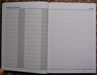
Then there is a page for telephone numbers and three pages of notes.

Telephone numbers and notes

Notes

At the back, after the diary pages, are four pages to summarise accounts (paid and received in separate tables), then an annual accounts summary and some statistical summaries. On the back cover is a year planner for 2014.

Account summary Jan to June

Account summary July to Dec

 
Account/statistical summaries

Back cover: 2014 planner

Diary pages:
The pages are slightly less than A6 in fact, at 14.2cm x 10cm (c.f. 14.8cm x 10.5cm for A6). The diary itself starts on December 24, 2012. The months are in clear sans serif font along the top with the date in bold next to the week day just below. There are 26 lines in total, though the bottom 6 are half-width as there is a month calendar towards the bottom of the page. Line spacing is 5.5mm and the “line” is actually made of dots. Saturday and Sunday share a page.
Notable information (holidays, moon phases etc.) are on the top line.

Diary pages

The pages are quite thin – at least as thin as filofax paper and possibly thinner. In total, the pages of the diary measure 8mm thickness. My immediate thought was, “Uh oh. These won’t handle any kind of pen well!” (given that the much thicker paper in my Ciak diary has bleed though from a biro!) but I was very pleasantly surprised.

Here are the fountain pen tests:
(the top two inks are Quink black ink cartridge and Parker black ink cartridge).


There was some feathering with the Parker Sonnet but not with any of the others, including the Waterman’s ink (which usually feathers and bleeds like nobody’s business).

Here is the reverse:


As you can see, very little bleed-through except from the Waterman’s ink. It’s certainly acceptable.
As it is, I will probably not use fountain pens on this paper anyway as my diary and daily task-lists are colour-coded to match the different areas of my life. A more realistic test would therefore be to use those pens.
Here’s the result:


And the reverse side:


Very little bleed-through at all. The paper looks very indented because I was writing on my proper desk which has a leather insert. I should have put something harder underneath or put the paper into the Mulberry before writing, for a proper test.

The case-binding was easy to dismantle (until the last set of pages in the section which were of course glued into the spine and needed some coaxing) and they were easy to trim to size and punch. At only 8mm deep, I can probably fit the entire year in the Mulberry, to be honest! I’m more likely to have 6 months in though. Currently, I have until the end of December 2012, but only because I haven’t dismantled the other diary yet.

In summary – I was very pleasantly surprised at how good the paper was, especially given that it only cost £1. Why can’t filofax use paper this thin but this good? It can’t be for reasons of cost! It must be just because they are thrawn. To use a good Scot’s word.

Saturday, 1 September 2012

Mulberry agenda - review


Oh, I think I am in stationery heaven today! The postman arrived laden with parcels for me this morning! Apart from some stove glass cleaner (dullsville), there were the following delights!
1: a Moleskine 2013 daily diary
2: a Parker Esprit with a fine nib
3: a ‘new’ Mulberry (new to me at least)

Parcels galore!

The others will have to wait their turns for reviews. Today I’m just going to review the Mulberry.

The listing said:
Mulberry Personal Organiser
Size: 7"x5"
Colour: Tan
Used but in good condition
Used only once

If it really was only used once, it wasn’t stored very well. The condition is nice, but definitely used. There are some marks on the press-stud area of the leather (grease marks from fingers I assume) and some circular indentations/ marks that look like the end of a pen top has dug in. There are one or two other dings and marks but it’s in pretty good nick and I like the ‘lived in’ look.

Now, possibly prompted by my DH, you might be asking WHY?
“Why are you needing another binder?”
“Why are you buying one in which none of your paper stash fits?”
“Just why, really…?”

To which I would say:
Because of the binder…
Because of the paper size…
Oh, just because!

Time for a walk-through.

Cover
As I’ve already said, the cover looks as if the binder has been ‘lived in’ despite the description from the seller. There is the usual beautiful Mulberry tree on the front in the bottom right corner. The binder is obviously from the same range as the Mulberry planner I bought a while back (another reason I wanted it). I’m not a lover of the crocodile effect leather – on the pale green one I use at work it’s there but it’s more like crocodile tummy than crocodile back (if you know what I mean) and is bearable. In the agenda size, I find the crocodile-effect texture just too much. 

Front cover

Mulberry tree

Back cover
Inside
Again, there are one or two dings in the leather but nothing drastic.
On the inside left, there is a set of three card slots (which had evidently never been used as they were still half sealed), with a half pocket behind. Behind that is a full height pocket (lined in beige fabric).
The ring diameter is 25mm and the mechanism clicks open and shut like a dream.

Inside (and note - flat as a bat!)

The back cover has a gusseted zipped pocket (again lined in beige fabric) with another full-height pocket behind.
The pen loop is all leather. It takes a Pilot 0.7mm point Frixion with ease. I would say that if the pen diameter is 1cm it will fit perfectly. The slim pens I use in my filofax (about 7-8mm diameter) are too slim for it.

Back cover

Okay, so that kind of deals with why I wanted the binder… it matches my planner, the leather is gorgeous, the quality is stunning…

“So what about the paper?? Isn’t Mulberry paper completely different in size from all the other planners? In other words, completely different from all the other paper you have in all those boxes in your desk??”

Yes.

And you know, that might just be perfect in some ways.

“Huh???”

The paper is A6 in size. Which means it is a bit wider than filofax personal and a bit shorter. I have struggled with the personal/pocket divide at times. The pocket, with its shorter-wider ratio always feels more sensible on the eye than the taller-thinner format of the personal. But pocket is just too small sometimes. And personal is too big sometimes.

Here’s a comparison of the three sizes of binders next to each other. Left to right: pocket Cavendish, Mulberry agenda, personal Baroque.

L-R: pocket FF, Mulberry agenda, personal FF

And here is a comparison of the paper sizes. Again, left to right, pocket filofax, Mulberry agenda, personal filofax.

L-R: Pocket, agenda, personal

Why does A6 feel the right ratio?
Well, it could just be that it is in the same range as A4 and A5. I’m sure I’m teaching you all to suck eggs, but A6 is the size of half an A5 sheet. The A1, A2, A3 etc range is based on the ratio of 1:2 and somehow this feels right when the personal filofax paper doesn’t.

The overall area is similar:
The agenda is 148mm x 105mm = 15 540mm2
The filofax personal is 171mm x 95mm = 16 245mm2

To be honest, there is plenty of space around the pages in the agenda so it could take slightly taller and wider paper if necessary.

But that would spoil the best reasons for buying it…

Which are…
that you can buy cheap diaries – both page per day and week to view in A6 almost everywhere
and that you can print your own things 4 to an A4 page with no faffing about to make it fit.

“Yes, but isn’t the hole spacing weird?”

Sort of…

The three holes are the same spacing apart as filofax but the spacing between the two sets of three holes is 38mm as opposed to 50mm. However, I have a hole punch where you can vary the spacing between the sets of three and can adjust it to fit the Mulberry.

Have I now found the perfect organiser??

Only time will tell, but fear not, I will keep you updated.