Friday, 25 September 2015

Moleskine soft cover lined notebook - review

I should know by now... I really should. But I'm such an optimist that I still carry this hope that a Moleskine notebook will be good.

SPOILERS...


It isn't.

Do I need to say more? Maybe someone out there only writes in pencil/biro. Though they possibly don't follow a blog in which fountain pens and ink feature quite so frequently.

Okay, so, once I stopped being petrified by the humongous writing to-do list, I thought I should contemplate which of the many hundreds of notebooks in my possession would be a good one to do further planning of 'book 6' (it does actually have a title... honest!). I've been doing all the planning up to now in A5 Ciaks but wanted something a bit bigger for the next bit of planning. One of my previous books was planned in a hardback Moleskine and that seemed to have stood up to fountain pen really well. Amazingly, I didn't have all that many notebooks that were bigger than A5 in 'the emporium' (as hubby calls it). I had a Leuchtturm 1917 A4+, a Grandluxe A4 notebook (uh oh... see here...) and 2 large(ish) Moleskines, both in their wrappers. I thought I would give them a go and see how they stood up to fountain pens (as I rarely use anything else in book planning).

I've not had great success with Moleskines recently but was prepared to put it down to "it's just the cahiers and diary that are so rubbish". Wrong. The notebook would be great, apart from the really quite major aspect of not being able to cope with fountain pen. At all.

The size is a decent size - 192 pages and 19x25cm (7.5x10") with narrow ruling of 6mm. The elastic closure on this one was a bit floppy but manageable. It's stitch bound and lies flat with no bother. There's a ribbon page marker and a pocket in the back cover and the usual twaddle in a leaflet, making preposterous claims about the history of the Moleskine brand... So far, so good.

But then... oh, then I did a fountain pen test. The pages aren't numbered so I pulled a page out in the middle of a set. Okay, several of my pens are in the 'lay down a lot of ink' group and some of the inks are a bit challenging (Emerald de Chivor, we're looking at you here...). Even so... Let's play fountain-pen bingo...
  • Feathering?
  • Bleed-through?
  • Show-through?

Full house.

Ugh. I'm embarrassed to have to show you quite how awful it is.

But I will...
[click on any picture to zoom in on how horrible it is]

1. Feathering
Maybe not so obvious here but...
...feathering on each ink
...more feathering
...even with the rollerball!

2. Bleed-through

Er... unusable!
Close-up
another close-up

3. Show-through
Almost irrelevant as the bleed-through is so horrific, but...

Bleed-through at the top, slight show-through below

Okay. I'll try the Leuchtturm next.


Tuesday, 22 September 2015

Overwhelmed by my to-do list

I don't mean the 'stuff that I should do today like laundry, shopping, paying bills' list. I mean the enormous, terrifying list of about three years' worth of stuff I need to do with my writing. It's now so huge that I don't even really know how to start. It's so overwhelming that I've been stunned into inaction (which isn't helping!).

I could break it down into smaller chunks, but then it would be even longer and no less terrifying. I know. I tried that.

It's not helped by the fact that some of the list is 'writing' and another fairly large chunk is 'stuff that also needs to be done but which isn't anything like as much fun'.

I'll get through it. Probably. Possibly. I'm hoping that once I leave work purgatory then I will stop ending up so demoralised and exhausted by it that I'm too tired to do the things I want to do (write). I'm hoping that I will be able to spend some of my week doing the more fun stuff (writing) and also devote time to doing the stuff that's less fun (everything else). I do know that I may never get to the end of it all. I won't have written all the books that are in my head right now before new ones pop up in there, clamouring to be written! It will take me at least three years to do what is currently on my list. In that time, another three books could have come along and started getting all demanding on me!

Any advice guys? How can I start to feel on top of a list that will take me several years to clear? And which in many ways never 'ends' because there will always be more things added to it before I've cleared even a fraction of it?

Help??

Monday, 21 September 2015

Birthday delights!

It's my birthday and although I am dismayed by the passing of another year (how have I got to this age?? When did that happen???) I am having a delightful afternoon with a pot of tea and a heap of new stationery to play with! I have some new pens, ink and paper to play with! How well people know me!
Here's some of the haul:
  • a Conklin stub nib pen
  • a selection of Iroshizuku inks
  • a little leather-bound notebook with Tomoe River paper
  • a writing set made from recycled elephant dung and recycled paper (no, it doesn't smell!)
Thank you everyone!!

Sunday, 20 September 2015

Circling back almost to where I started...

Life is about to change enormously for me as I leave work purgatory in a week. I'm wondering what system will work well for me once I am pretty much in charge of my time. In trying to help me to decide, I thought I would run through what I've used over the years and what has or hasn't worked for me.
Basically, I have chopped and changed almost as many times as I've had hot dinners, and wasted huge amounts of money on trying to find the 'right binder' (when I was probably hunting for the right system), but a few things have become apparent: I like week+notes and a DPP. Pocket doesn't work for me, however cute the binders are. And I'm rubbish at turning the page so in fact, I don't need to carry both W+notes and DPP around with me; just the W+notes will do!

How did I get to this point of realisation? Read on (if you're suffering from insomnia) and I'll take you through the disasters of the years!

In the beginning (a.k.a. 2011)
January: I used an A5 at work and an A5 at home and was struggling to get my head around using a personal for my day to day carry around. I was also debating whether or not to buy a personal size filofax! Scoot forward to April 2011 and I was faffing over A5 or Personal and wrote this post about what I needed in a carry-around. It's really interesting (at least to me) that what I needed then is exactly what I need now! Even then I found it nigh on impossible to turn a page to see what I was supposed to be doing and liked the thought of a week plus notes. Plus ça change and all that.

By the end of April 2011, I had moved wholeheartedly into the pink Baroque and was loving it. It functioned as my wallet as well as a planner and I loved it. I then bought a turquoise Baroque. And then a green Portland.

It's now beginning to get embarrassing reading over these old posts as, in August 2011 I was pondering personal or pocket and deciding to stick with personal (see the post here) but by the end of August 2011 I had bought my first (of many!) pocket filofaxes - a pocket Cavendish (see here for the post saying I'd bought it and here for more details on the binder). However, I stayed in the personal size (and the pocket went into the drawer of my desk and tried to have a party on its own) and even bought a Cavendish (see here and here for details).

2012
2012 was a year of faffing about, BIG TIME! Though I do note that I realised even then, that a month to view did not work for me!
February: I was wondering about moving into pocket size (see here); I bought the pocket Aston (see here) and moved in (see here).
April: I'd bought a personal Holborn (see here) and was wondering if I had planner fail (see here).
May: I was still in the pocket Aston and had shifted to week + notes for the diary (see here)
By June, I was in the personal Holborn; by July I had bought two A5 Mulberry binders (admittedly not as carry-arounds!); by August I'm on about the current carry about being the pink Baroque again, but had bought a Mulberry A6 and a pocket Baroque... In September, I moved into the A6 Mulberry (Indie). My old foe, the desire for colour had struck again by December and I was out of Indie and had bought a scarlet Mulberry AND a wine Holborn.
So, in 2012 I had used: personal, pocket, personal, A6. Would 2013 be any more stable?

No.

2013
I bought:
January - Green pocket Mulberry (Loki)
April - pocket Classic in red (see here)
August - pocket Portland in red (see here)
September - personal Portland in blue (see here)
December - another A5 Mulberry (see here)

System-wise, I was all over the place!
January - A6 Mulberry (Red)
April - pocket Baroque
May - personal Holborn (wine); August - personal Baroque
Most of the rest of the year I was havering over personal or A6.

2014
I think my favourite post of all time summed it up>>>> Siren songs
Despite those siren songs, I spent the whole year using personal size paper. Admittedly there was still some binder chopping and changing: turquoise Baroque to wine Holborn to navy Portland and then to slimlines - the red de Villiers (my most successful binder ever!) and then compact Cavendish.

2015
Well, we're not done with it yet, but I've changed system dramatically once already!
I started the year still in a compact. My beloved red de Villiers was beginning to get worn, so I moved into the wine Holborn (briefly), tried the compact Cavendish and then I tried a compact Belgravia (see here for a compare/contrast between Cavendish and Belgravia). Mid April saw a red Traveller's Journal by The Stamford Notebook Company arrive but although I loved it, I didn't move in. Instead I bought a compact Holborn (see here) and then a slimline Adelphi (see here). Despite that ticking ALL the boxes, I still shifted into the TJ, partly because it was new and partly because I needed the page size.

So here we are, several years down the line and more binders than I want to think about, and I find I am back with a week+notes in almost A5 size and a DPP in my reporter's notebook. I realise that I need a colour pop (so no more black binders!) and I need cards and money to be catered for. Whether that's in the scarlet Adelphi or the Stamford Traveller's Journal in 2016 is yet to be decided. Let's see how the last quarter of 2015 goes, once I have left hell.

Thank you, everyone who has been on this journey with me!

Saturday, 12 September 2015

Sparkly inks - J Herbin 1670 Collection

Those who know me will know I'm not a 'bling' kind of person, but inks with gold (or silver) in them? Oh, bring them on!

J Herbin do a collection of inks with gold dust in them (see their webpage here). There are occasionally new additions to the range and at the moment, there are four shades available: Stormy Grey, Ocean Blue, Emerald de Chivor and Rouge hematite. I'm not a huge lover of red ink, even if it does have gold in it, but I do have the other three. They are really difficult to photograph! All of the samples shown are written on Tomoe River white (really ivory) paper and photographed in the sunshine. Click on any picture to enlarge (and sorry they do not show the inks to their best!).

1. Stormy Grey
In some ways this is my least favourite of the three, though when I first tried it, I loved it. I do love the fact that it dries to a dark charcoal grey. What I don't like quite so much is the yellow overtones without the sparkle. It's lovely if it catches the sunlight and the gold glints, but otherwise the gold puts a yellow cast over the ink. When wet, the ink is even more jaundiced-looking, but as it dries, it darkens.

Taken in sunshine with
the camera directly above
Taken in sunshine with the camera at an angle to get the sparkles
Again, taken at an angle, in sunshine

2. Ocean Blue
This is a really lovely colour - a solid, dark blue and the gold highlights are superb. I adore it!

Taken in sunshine with the
camera directly overhead
Taken in the sunshine with the camera at an angle to show the sparkles
Again, taken in sunshine with the camera at an angle to show the sparkles

3. Emerald de Chivor
This is the one that people have been going nuts over, possibly because it is the newest addition to the collection. It is indeed a fabulous colour - dark green with a hint of blue and some really beautiful shading that I haven't seen quite so much on the other inks. I absolutely adore this ink!

Taken in sunshine with the
camera directly above
Taken with the camera at an angle to try and show the sparkle
Again, taken at an angle to show the sparkle

One thing that I have noticed is that I get huge amounts of the ink on my hands when filling up pens with any of these three inks! I thought it was just me, but I sent samples to a good friend and he said he was covered in ink when he filled his pens with them too. Anyone else finding that? Is it a particularly 'climbing' ink? i.e. does it have more capillary action than other inks and so climb the sides of things (bottles, pens etc.) more than others? I'd be interested to know if others are finding the same thing!

As well as J Herbin producing sparkly inks, Diamine is about to produce some too. They will be in a variety of colours and available from October. Some of the colours have silver in them and some gold. Goulet Pens blogged about it and have a great picture of the inks on this post. I've got my eye on Night Sky, Blue Lightning and Blue Pearl already! I'm hoping that the Night Sky version, with silver rather than gold, will be less jaundiced-looking.

Who else is a sparkly ink fan?

Update:
Bureau Direct are running a competition to win a set of the Diamine sparkly inks. Click here to enter. 

Wednesday, 9 September 2015

Review: Sheaffer calligraphy pens

Sheaffer calligraphy pen
I confess to owning several of these now. I vastly prefer my handwriting using a calligraphy pen - perhaps because I write more slowly; perhaps because the broad edge just makes my writing better - and possibly at least a third and closer to half of my pens are calligraphy ones. Of those, 5 are Sheaffer (NONE are Lamy Joyless - the one I had (and hated; see here) got sent away to someone else!).

So why do I keep coming back to them?

Well, I can't deny it, they're cheap! They are fairly easy to find online with a price tag of between £4 and £10. I also bought converters to use mine with bottled ink. They are perhaps less easy to get, but Cult Pens for one sells them (no affiliation).

The Sheaffers also have pretty decent nibs, considering the price tag! I've never had one that skipped or dried out. They write more smoothly than some of my Parker italics (which can gouge into the paper sometimes) and there is always good shading with the inks.

They're never going to win any beauty prizes though.

The pens come in three nib sizes and the barrel of the pen are colour-coded: red for fine (1.0mm), yellow for medium (1.3mm) and orange for broad (1.8mm). It used to be that the barrel was black and there was a colour-coded sticker on the end that said what nib was in the pen. They are now 'new, improved' versions and the whole of the barrel changes colour (and the colours are not the same as the old coding...). Thankfully, the nib size I like to write with is 'fine' and that's the red one. I'm not sure I would want either the yellow or the orange.

There is a 'viewing window' in the barrel so you can see how much ink is left. This is essentially a hole in the barrel and it does have quite harsh edges which can dig in. I just either tighten or unscrew the barrel slightly so that the holes are rotated away from my hand.

At the writing end, there is a rubberised grip which I find very comfortable. I'm not a fan of pens with a ridge just before the nib and even less of a fan of a moulded grip! All of my favourite pens are just round at the grip, with no ridge.
The rubberised grip can slide up and down a bit, but is easy to slide back if it moves when you're changing ink/cartridge etc. When the pen is assembled, the grip doesn't move at all; it's only when you're changing ink to be honest.

I don't know what the 'improvements' are, other than making them look worse by changing the black barrel for red, yellow and orange. The nibs feel the same to me.

The packs I bought were also supposed to contain two cartridges - one black and one blue, but when they arrived, one pack was missing the black cartridge. I don't mind at all as I don't use the cartridges! I contacted the seller and they have promised to pop a 'goodie' in for me as compensation, next time I order from them. (I did tell them that I wasn't bothered by the lack of the cartridge - I was only telling them so that they could check their other stock and contact their supplier if there were more occurrences).

No black cartridge
Both cartridges present and correct
Anyway, the main reason that I bought another two pens was because I have also succumbed to the J Herbin 1670 sparkly inks (post still to come on them!) and wanted to have a couple of cheap pens that I liked as dedicated 'sparkly ink' pens in case the gold/silver dust in the pens jammed anything up. The Sheaffers are perfect for this as they show the shading well and have a good ink flow. And if the sparkles clog them up, it won't break the bank to replace them!

Do others have a favourite brand they return to again and again? And does anyone else have 'dedicated pens' like this (whether dedicated to sparkly inks or anything else)?

Saturday, 5 September 2015

Review: Hightide A5 foolscap notebook

I have been very remiss in my reviews! I have a heap of stuff to review but not so much time... LOTS more time after the end of September of course (when I leave purgatory work).

Anyway, I recently purchased a couple of A5 notebooks by Hightide (Penco), from The Journal Shop (no affiliation). The Journal Shop site describes the notebooks thus:
"Penco's Foolscap Notebooks are typical of high quality Japanese paper (the likes of which you may already be familiar with in other brands such as Life or Mnemosyne). Smooth, fountain pen friendly paper is a pleasure to write on, and the paper suffers very little showthrough and no bleed or feathering. The notebook lies open perfectly flat (with hardly any coaxing). Sewn and glue bound, not stapled."
I thought I would give them a try and a couple arrived the other day. [Click on any picture to enlarge]

Cover; first page:
The cover is card, with space on the front to write a title.

Front cover

The back of the notebook has a bit of information about the paper.

Back cover
The first page inside is a pale green (not coming out well in my pictures) for producing an index.

Index page

Evidently you are meant to write pages and pages about each thing as there are 20 spaces and there are 100 pages (200 sides) in the notebook. The reverse of the index is plain - it doesn't carry on overleaf.

Size and lines spacing:
As you can see from the information on the back cover, it is almost A5 size at 138 x 210mm. There is a blue line at the top and the bottom of the page and the other lines are in grey. Line spacing is 7mm and the top margin is 16mm and the bottom margin is 12mm. There are 26 lines per page.

Lines; line spacing
The photo shows the centre of the book and yes, it does lie flat. That said, now it has been opened out like that, the edge of the notebook is no longer smooth. There is a break where the very centre is (i.e. where I opened it out flat). This is much like what happened with the Quo Vadis APB2 (see here as long as you're not squeamish about stationery-abuse).

Pen tests!
I much prefer to write in fountain pen and so for a notebook to be worthy of further purchases, it has to be able to handle a fountain pen and for a) the ink not to bleed through, b) the ink not to feather, and c) the ink not to show through to the other side. So, how did this little notebook do?

Well, the surface is nice. It's a little 'grabby' but not too much. The pen doesn't glide in quite the same way as it would over Clairefontaine paper (for example) but it doesn't snag. The texture also allowed ink to dry quickly - faster than it does on Clairefontaine. There was no feathering and no bleed-through. However, there was show-through to the other side.

Fountain pen/ink tests
Reverse. It's actually worse than this picture indicates
Overall:
I quite like the book, though I'm disappointed at the level of show-through. It's enough to stop me wanting to use it for book plotting, but it's okay for me to use as a general notebook.

Sunday, 30 August 2015

Traveller's Journal - update

Stamford Notebook Co.
Traveller's Journal

I've now been using the Stamford Notebook Co.'s Traveller's Journal since June 15th so it's time to tell you how well it's working out. I blogged about the set-up here.

Order of stuff in the TJ:
At the front, I have the zipped pocket/two slip-pockets Midori insert (Midori 008, blogged about here). That's wrapped around a card-holder insert (Midori 007, blogged about in the same blog post).
I did have them around separate elastics, but then slipped them around the same one so the cards are in the middle.
Then there is a Moleskine (spit, spit, spit... horrible quality, NEVER buying them again) cahier with the week plus notes diary.
At the back is another Moleskine cahier (still spit, spit, spit, horrible quality, never buying it again) - this one is lined and is for notes.

How it's all been working out:
The home-made week plus notes diary (blogged about a lot - see here for main post) is working REALLY well. I may not continue blocking the RHS into eight zones next year, but I will continue to write next-action lists based on life areas. The only reason I might not block the RHS out into eight equally sized blocks is because I sometimes need more space on some things than I do on others.

Week plus notes diary
The tracking boxes are also working really well and remind me to do stuff I keep forgetting to do!

The notes cahier is also useful - I've always had a notes section in my Filofax, so no great surprise there.

The Midori inserts are okay. Because there's no pen holder in the TJ, I've popped an erasable pen (uni-ball signo TSI; freebie from Cult Pens!) in the zipped pocket and that's okay as long as I don't have a lot of cash. If I do have a lot of cash, the pocket gets a bit bulky with the pen in there too.
The cards can sometimes seem a bit loose in the card holder. They won't fall out, but sometimes they do move significantly towards the outer part of the slot. For a couple of them I've put two cards in because the slot really has seemed too loose and things were almost falling out. Likewise with the slip-in pockets (other side of the zipped pocket insert) - receipts almost fall out and the paper money in there feels like it's held very loosely. I'm contemplating getting something else to hold the wallet aspects of it all but I'm not sure what. Suggestions? (Remembering I'm based in the UK and shipping from the US can be prohibitively expensive).

What I do miss is an address book. Yes, I'm only needing to look for addresses at home and yes, I have them in a Filofax at home but for some reason I want them in the TJ. Though probably not enough to get an address book insert for the TJ! I know - go figure...

Other than those minor niggles, it's still working out well for me.

Tuesday, 18 August 2015

Quo Vadis ABP 2 - update

It lies flat!

It lies flat!!

Look away now if you like your stuff pristine...


Okay. It was a bit resistant and so I broke its spine in a few several places and now it lies flat just fine.
:-)

However, it now looks like this:

A bit battered
Major spinal injuries!
Less pretty; more useful though

But, it lies flat!

So, for those of you who like the thought of the ABP 2 but wanted it to lie flat (and don't mind beating it into submission), then rest assured, it will lie flat!

I started near the start of the diary, opening it out (hideous cover removed) and flattening out the pages, then I decided that the best solution would be to go to the middle and work outwards. I found the middle of the book and then bent it completely back on itself so that the two covers were touching. This (naturally) broke its spine (something I would hate to do on most books!!). I then worked my way out, section by section, re-breaking the spine at each junction between sets of pages and again at the mid-point of each block of pages.

I realise this is quite brutal, but my stationery has to work for me! I didn't buy it to look at! I bought it so it would work! This wasn't going to work if it wouldn't lie flat. I don't care that it looks a bit really quite battered. It's not going to be out and about with me as it's my daily planner and will sit on my desk.

Has anyone else brutalised some stationery to make it work for them?

Monday, 17 August 2015

Quo Vadis ABP 2 - review

[Sorry for the lack of posts - a family crisis pulled me away from pretty much everything! All is well now though!]

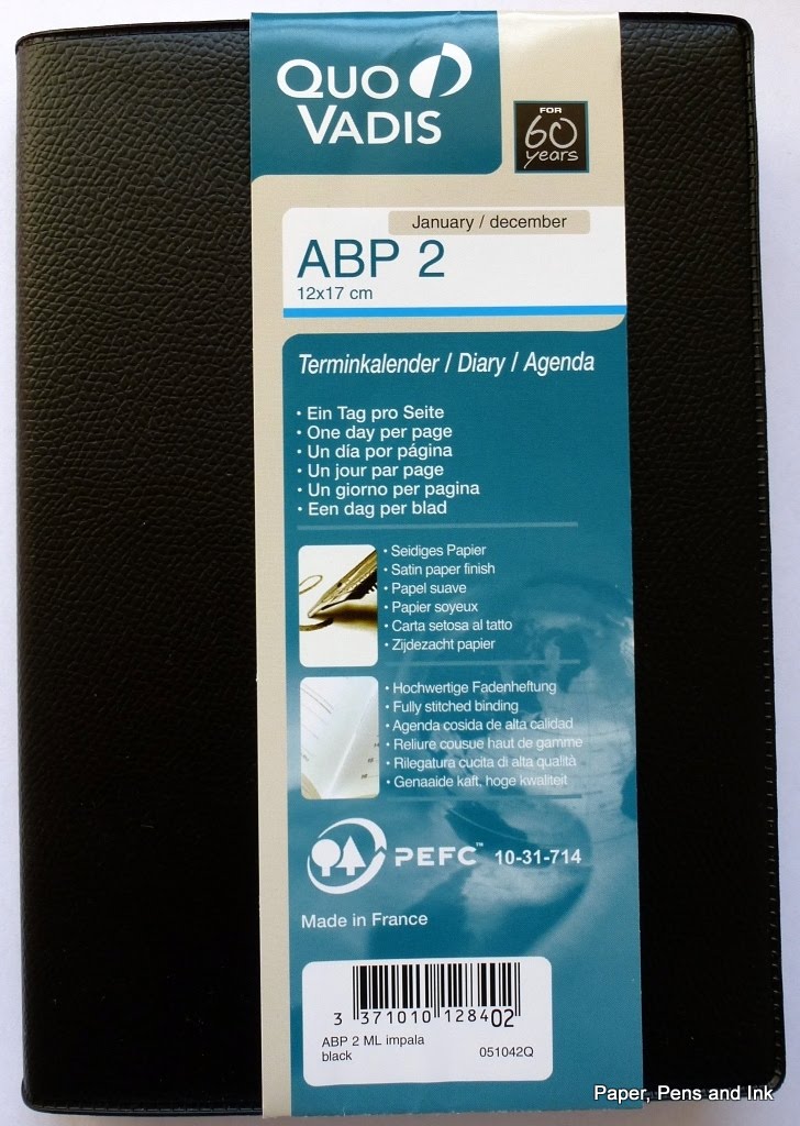
Quo vadis ABP 2 diary

Today's review is of the Quo Vadis ABP 2 daily diary for 2016. I bought this to use as a better quality version of the reporter's notebook that I've been using as my day-planner! In the reporter's notebook, I've drawn a line down the middle of the page, added times to the LHS and then used the LHS to time-box activities and the RHS for to do lists, notes and so on. This has been working brilliantly (except on weeks when family crises occur and throw all my planning out the window...), but I thought I would try a 'proper' daily diary with a similar layout for next year.

Enter the Quo Vadis ABP 2.

I ordered mine from Bureau Direct (no affiliation, just a long-term, happy customer) and asked for the black cover. It arrived (as ever from Bureau Direct) well packed and very promptly. Click on any picture to enlarge.

First impressions:
1. It comes with a vinyl cover in a 'pebbled leather' effect. That's hideous and I'm going to be removing it. I may put the diary in another slip cover, but I may just leave it coverless. It isn't a diary that will be going out and about with me, it will just sit on my desk. If I feel really inspired, I will re-cover it.

Pretty hideous cover
With vinyl cover removed

2. It probably won't lie flat without some brutal treatment. Which is fine as I have been known to be brutal with things to make them lie flat! It's disappointing in many ways though as I think it might annoy me. The alternative (if it really won't lie flat) will be dismember it and put it in a ring-binder.

3. The line spacing is tiny! We're talking 3.5mm line spacing!

Seriously narrow line spacing!

4. Apart from the line-spacing, the layout is great! It has timed slots down the LHS which I can use for time-boxing and space on the RHS for notes, to-do lists etc. There is also space at the bottom for other jottings (and sadly, one of those daft little calendars that are neither use nor ornament, but hey ho).


5. There are tear-off corners so you can flip to the right day without needing a bookmark.

6. There is a plethora of languages on each page which makes it a bit busy

7. There are maps and other information pages. I will probably use the address pages as space to write my monthly goals (or ignore them altogether...). The maps I might colour in if I'm bored. I never really need most of the extra pages in a diary to be honest! I know others love them though.

Front page
Info page
Holiday dates (to fill in)
2016 calendar
What a double spread looks like
(Saturday and Sunday get a page each)

2017 calendar
First of several maps
More maps
Address pages
List of Public Holidays for 2016
(plus signs of my brutality, making it open flat!)


I haven't done any pen tests on it yet - I'll post again when I have.

Does anyone else use this format? How have you found it?